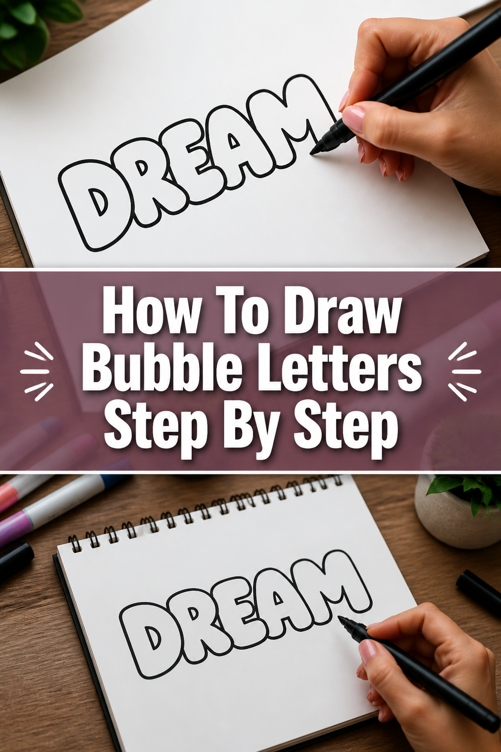
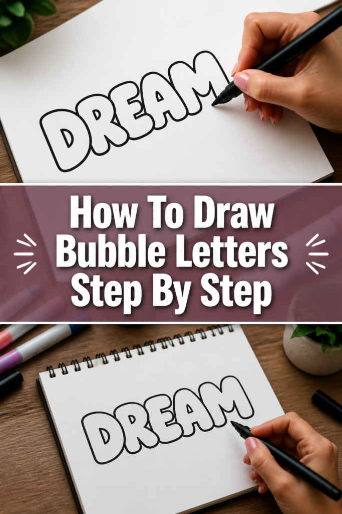
How To Draw Bubble Letters Step By Step
& Painting
No rigid rules or pretension. Just practical guides, medium comparisons, and encouraging tips to help you enjoy the drawing & painting process.
I remember sitting in the back of my sixth-grade classroom, filling the margins of my notebook with puffy, cloud-like words.
It was my first real introduction to the world of typography and street-inspired art.
After years of refining my technique for posters, murals, and digital designs, I have perfected a foolproof method for anyone to learn.
Quick Overview
This guide will take you from a basic stick letter to a fully rendered, three-dimensional piece of bubble art.
- Time needed: 20 to 30 minutes
- Difficulty: Beginner
- What you’ll need: Pencil, eraser, paper, fine-tip black marker, and colored markers or pencils
Step-by-Step Instructions
Step 1: Sketch the Skeleton
Start by drawing a very light version of the word you want to create in standard print.
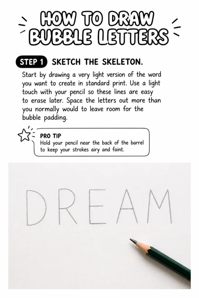
Use a light touch with your pencil so these lines are easy to erase later.
Space the letters out more than you normally would to leave room for the “bubble” padding.
Pro Tip: Hold your pencil near the back of the barrel to keep your strokes airy and faint.
Step 2: Map the Padding
Imagine each line of your letter is a bone and you are adding a layer of soft cushions around it.
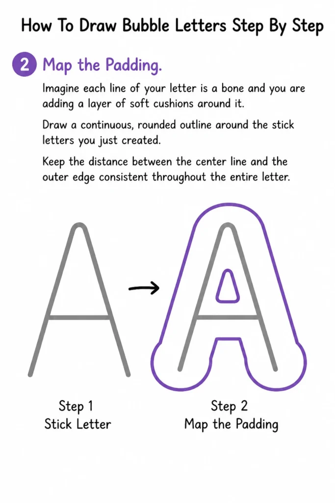
Draw a continuous, rounded outline around the stick letters you just created.
Keep the distance between the center line and the outer edge consistent throughout the entire letter.
Step 3: Round the Corners
Focus on turning every sharp angle or corner into a smooth, circular curve.
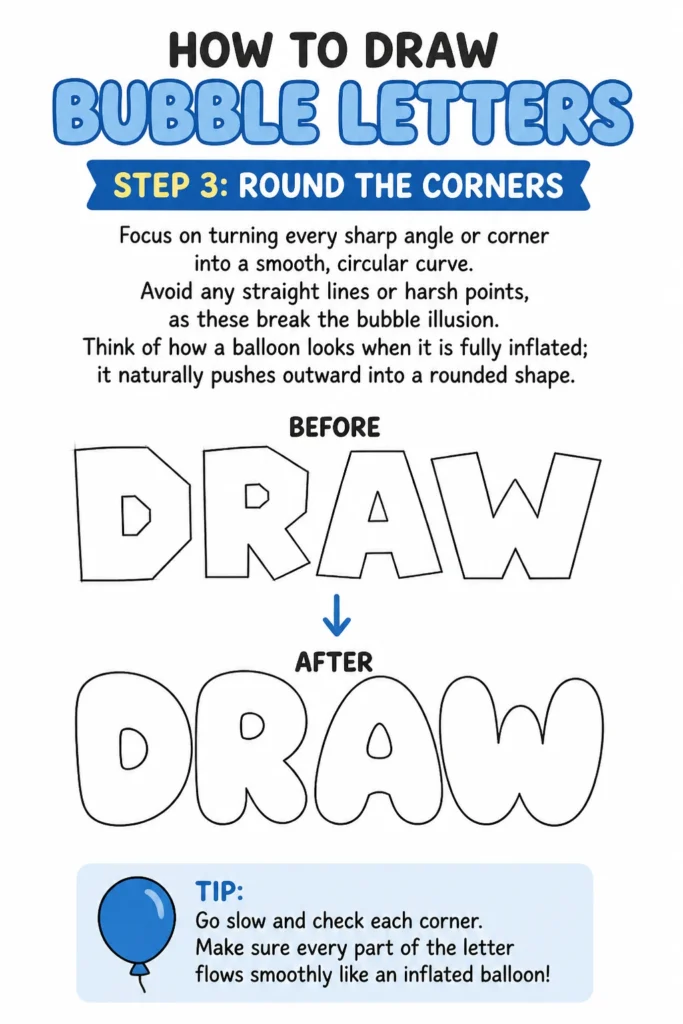
Avoid any straight lines or harsh points, as these break the “bubble” illusion.
Think of how a balloon looks when it is fully inflated; it naturally pushes outward into a rounded shape.
Step 4: Create Overlaps
Decide which parts of the letters will sit “in front” and which will sit “behind.”
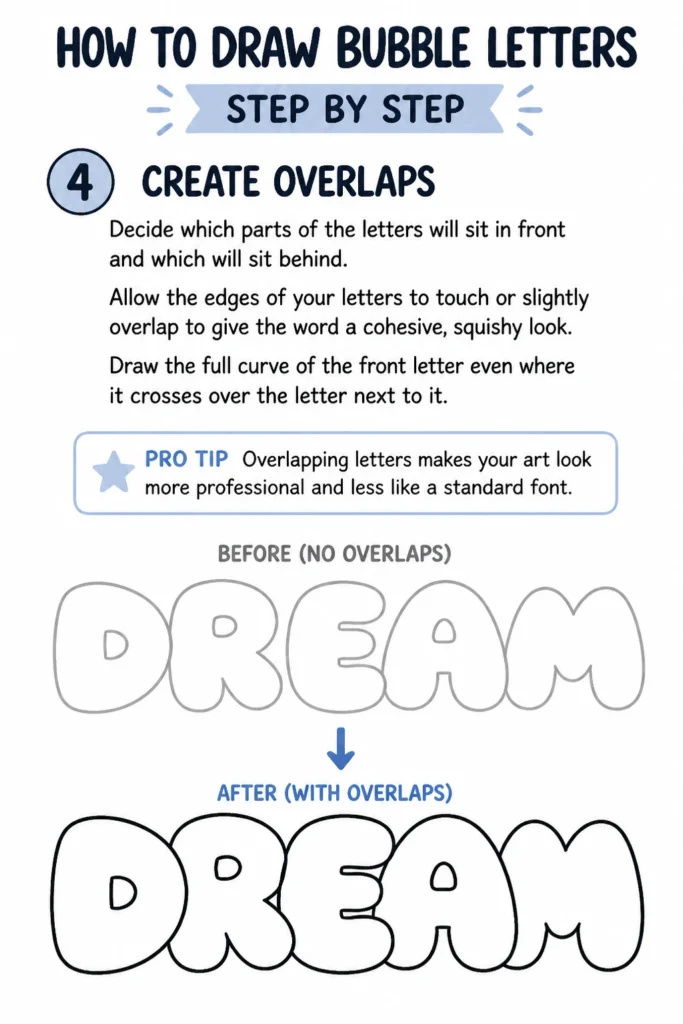
Allow the edges of your letters to touch or slightly overlap to give the word a cohesive, squishy look.
Draw the full curve of the front letter even where it crosses over the letter next to it.
Pro Tip: Overlapping letters makes your art look more professional and less like a standard font.
Step 5: Erase the Internal Skeleton
Remove the original stick-letter lines from the inside of your bubbles.
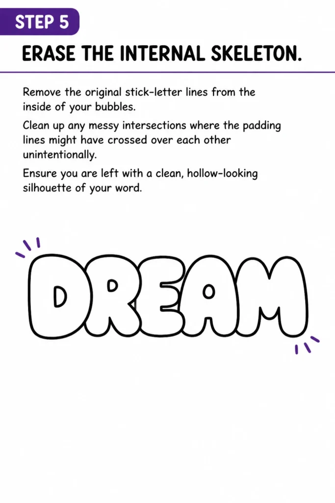
Clean up any messy intersections where the padding lines might have crossed over each other unintentionally.
Ensure you are left with a clean, hollow-looking silhouette of your word.
Step 6: Refine the “Holes”
Adjust the internal spaces of letters like A, B, D, O, P, Q, and R.
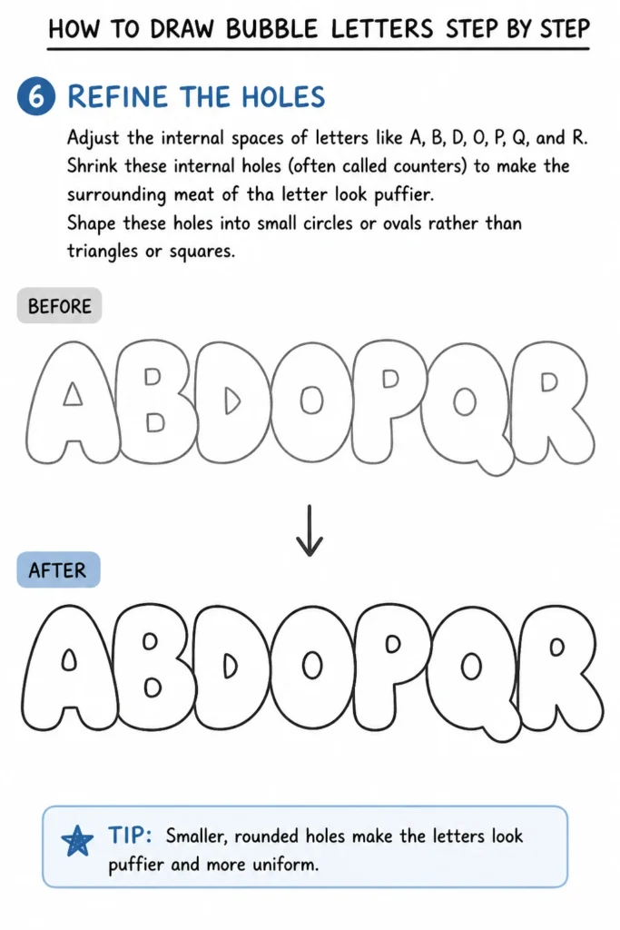
Shrink these internal holes (often called counters) to make the surrounding “meat” of the letter look puffier.
Shape these holes into small circles or ovals rather than triangles or squares.
Step 7: Ink the Final Outline
Trace over your final pencil lines with a black marker or felt-tip pen.
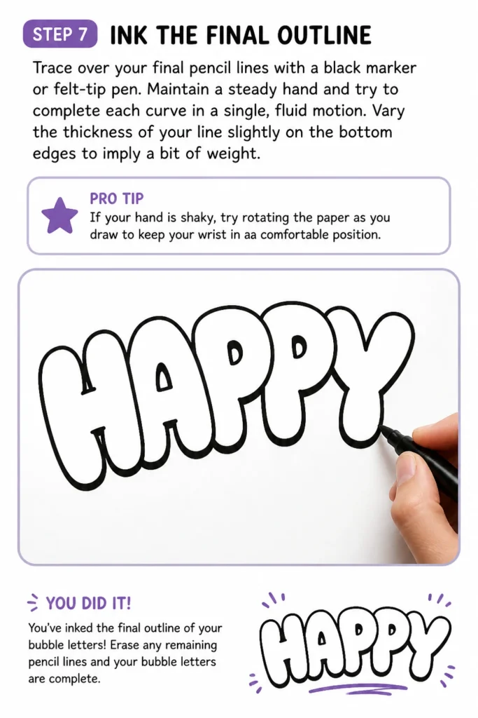
Maintain a steady hand and try to complete each curve in a single, fluid motion.
Vary the thickness of your line slightly on the bottom edges to imply a bit of weight.
Pro Tip: If your hand is shaky, try rotating the paper as you draw to keep your wrist in a comfortable position.
Step 8: Add Highlights and Reflections
Identify a consistent light source, such as the top-left corner of your page.
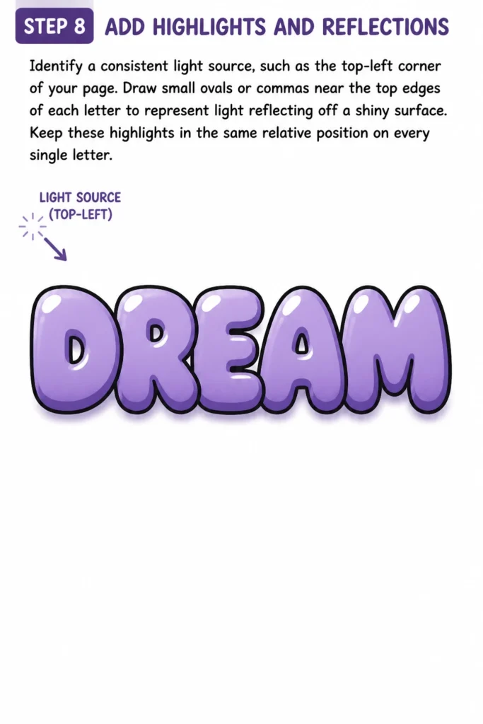
Draw small ovals or “commas” near the top edges of each letter to represent light reflecting off a shiny surface.
Keep these highlights in the same relative position on every single letter.
Step 9: Create a Drop Shadow
Project a second outline behind your letters on the side opposite your light source.
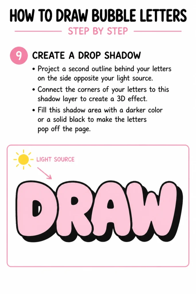
Connect the corners of your letters to this shadow layer to create a 3D effect.
Fill this shadow area with a darker color or a solid black to make the letters “pop” off the page.
Step 10: Apply Color and Gradient
Select two or three shades of the same color for a professional gradient look.
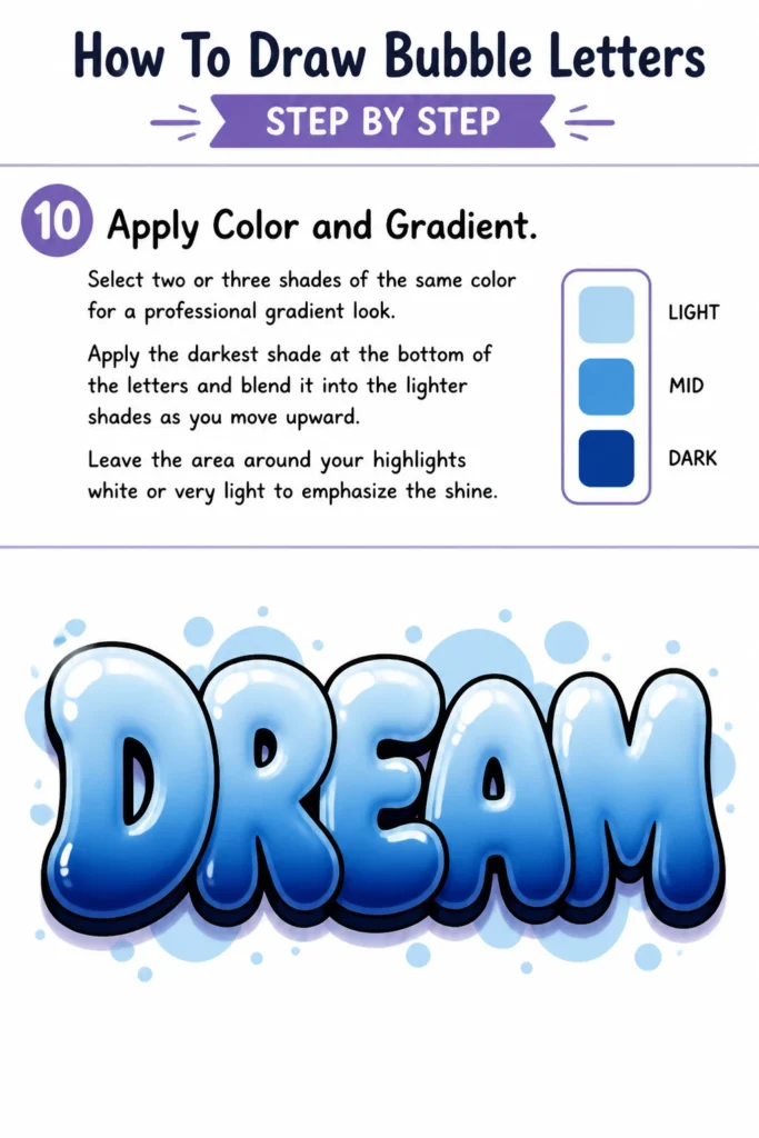
Apply the darkest shade at the bottom of the letters and blend it into the lighter shades as you move upward.
Leave the area around your highlights white or very light to emphasize the shine.
Common Mistakes to Avoid
Making Letters Too Skinny
Many beginners are afraid to let their letters get wide, resulting in “sausage” letters rather than bubble letters.
True bubble letters should look like they are under pressure and about to burst, so don’t be afraid to make them thick and chunky.
Inconsistent Spacing
If one letter is floating far away while others are tightly packed, the word will look disjointed.
Try to keep the “gap” or “overlap” distance the same between every character in your word.
Sharp Internal Angles
People often remember to round the outside but leave the inside of letters like ‘M’ or ‘W’ very sharp.
Every single junction should be curved to maintain the soft, inflatable aesthetic.
Troubleshooting
My Letters Look Flat
This usually happens when there is no contrast between the light and dark areas.
Increase the size of your drop shadow and make sure your highlights are bright white.
The Ink Is Smudging
This is a common issue when using markers over pencil or when moving too quickly.
Always wait for your ink to dry completely before erasing your pencil guidelines or adding color.
The Letters Are Different Sizes
It is easy for the first letter to be huge and the last letter to be tiny.
Draw two very light horizontal “boundary lines” at the top and bottom of your workspace to keep all letters at a uniform height.
Key Takeaways
- Start light: Use faint pencil lines for the skeleton so you can erase them without leaving marks.
- Embrace the curve: Eliminate all straight lines and sharp points to achieve the “bubble” look.
- Consistency is king: Keep your light source and padding thickness the same across the whole word.
- Layer your depth: Use drop shadows and highlights to transform a flat drawing into a 3D object.
- Color with intent: Use gradients to mimic the way light hits a rounded, three-dimensional surface.
Frequently Asked Questions
What are the best markers for bubble letters?
Alcohol-based markers are generally the best choice because they blend smoothly without streaking.
Water-based markers are also great for beginners, but they can sometimes tear the paper if you layer them too much.
How do I make bubble letters on a computer?
You can use a digital brush with “streamline” or “stabilization” settings to get perfectly smooth curves.
Most digital artists use layers to keep the outline, the color, and the shadows separate for easy editing.
Can I use this technique for lowercase letters?
Absolutely, though lowercase letters often have more complex curves that require extra attention.
Focus on making the “ascenders” (like the top of a ‘b’) and “descenders” (like the bottom of a ‘p’) extra round.
Our Top Recommended Finds
- Dual-Tip Alcohol Markers: These allow for both broad strokes and fine details, making gradients easy to achieve.
- Acid-Free Sketchbook: Higher quality paper prevents ink from bleeding through and keeps your colors vibrant over time.
- Kneaded Eraser: This type of eraser is gentle on paper and can be molded into small points to clean up tight corners.
Level Up Your Creative Lettering Today
Now that you have mastered the basics of bubble letters, the possibilities are endless.
You can experiment with “melting” effects, adding patterns inside the letters, or even creating “glass” textures.
Grab a fresh sheet of paper and try writing your name using the three-dimensional shadow technique right now.
The more you practice these rounded shapes, the more natural and fluid your hand lettering will become.
& Painting
No rigid rules or pretension. Just practical guides, medium comparisons, and encouraging tips to help you enjoy the drawing & painting process.