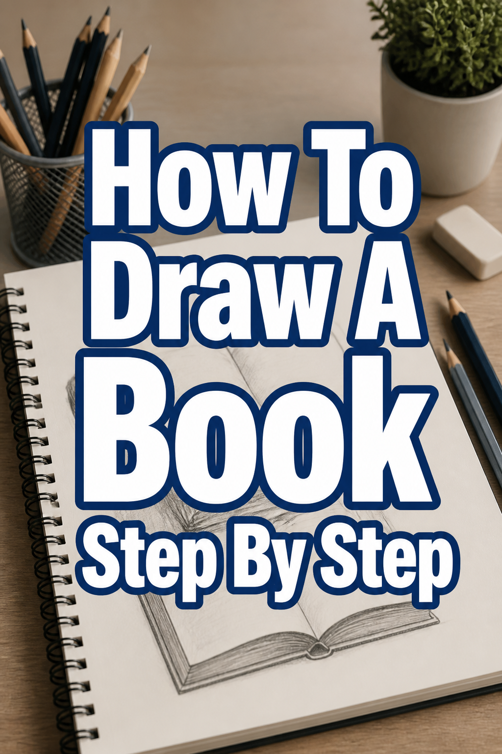
📖 How To Draw A Book Step By Step
& Painting
No rigid rules or pretension. Just practical guides, medium comparisons, and encouraging tips to help you enjoy the drawing & painting process.
Learning to draw a simple book is a fantastic way to practice fundamental drawing skills.
I remember the satisfaction of sketching my first believable book, realizing how simple shapes can transform into something recognizable.
This guide will walk you through each step, making the process straightforward and enjoyable, drawing on years of sketching practice.
Quick Overview
You’re about to create a realistic book drawing, building from basic shapes to intricate details.
This process will strengthen your understanding of perspective, form, and shading.
- Time needed: 30-60 minutes (depending on detail)
- Difficulty: Beginner
- What you’ll need: Pencil, eraser, paper, ruler (optional)
Step-by-Step Instructions
Step 1: Sketch the Basic Form – The Front Cover
Begin by lightly drawing a simple rectangle on your paper.
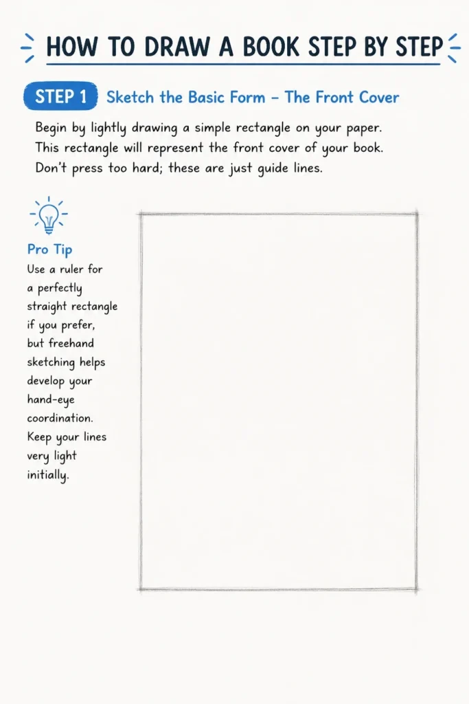
This rectangle will represent the front cover of your book.
Don’t press too hard; these are just guide lines.
Pro Tip: Use a ruler for a perfectly straight rectangle if you prefer, but freehand sketching helps develop your hand-eye coordination. Keep your lines very light initially.
Step 2: Add Depth – The Side of the Book
Draw a second rectangle extending from the first, either to the right or left.
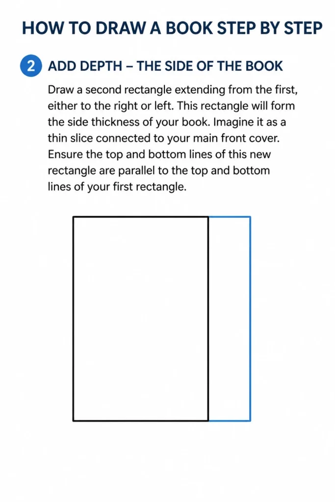
This rectangle will form the side thickness of your book.
Imagine it as a thin slice connected to your main front cover.
Ensure the top and bottom lines of this new rectangle are parallel to the top and bottom lines of your first rectangle.
Step 3: Connect for Three Dimensions – The Spine
Connect the corners of your front cover to the corners of your side rectangle.
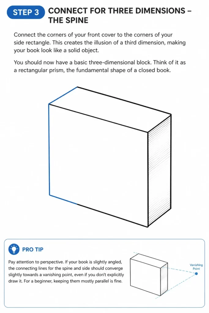
This creates the illusion of a third dimension, making your book look like a solid object.
You should now have a basic three-dimensional block.
Think of it as a rectangular prism, the fundamental shape of a closed book.
Pro Tip: Pay attention to perspective. If your book is slightly angled, the connecting lines for the spine and side should converge slightly towards a vanishing point, even if you don’t explicitly draw it. For a beginner, keeping them mostly parallel is fine.
Step 4: Define the Spine and Pages
Draw a subtle curved line along the spine of the book.
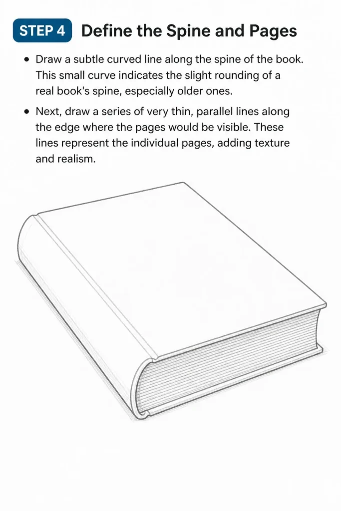
This small curve indicates the slight rounding of a real book’s spine, especially older ones.
Next, draw a series of very thin, parallel lines along the edge where the pages would be visible.
These lines represent the individual pages, adding texture and realism.
Step 5: Refine the Outlines and Erase Guides
Go over your main book outlines with a slightly firmer hand.
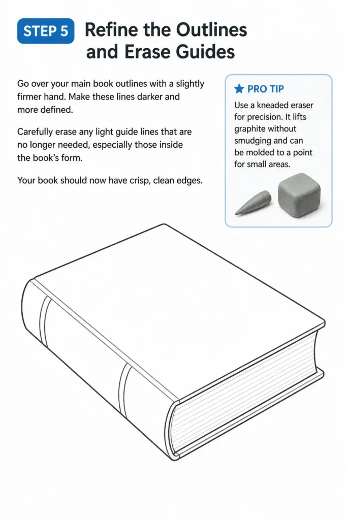
Make these lines darker and more defined.
Carefully erase any light guide lines that are no longer needed, especially those inside the book’s form.
Your book should now have crisp, clean edges.
Pro Tip: Use a kneaded eraser for precision. It lifts graphite without smudging and can be molded to a point for small areas.
Step 6: Add Cover Details and Texture
Sketch a simple design on the front cover.
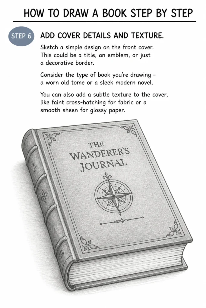
This could be a title, an emblem, or just a decorative border.
Consider the type of book you’re drawing – a worn old tome or a sleek modern novel.
You can also add a subtle texture to the cover, like faint cross-hatching for fabric or a smooth sheen for glossy paper.
Step 7: Introduce Shading for Form and Light
Determine a light source for your drawing.
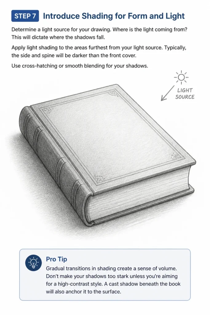
Where is the light coming from? This will dictate where the shadows fall.
Apply light shading to the areas furthest from your light source.
Typically, the side and spine will be darker than the front cover.
Use cross-hatching or smooth blending for your shadows.
Pro Tip: Gradual transitions in shading create a sense of volume. Don’t make your shadows too stark unless you’re aiming for a high-contrast style. A cast shadow beneath the book will also anchor it to the surface.
Step 8: Final Touches and Highlights
Add a few small highlights where the light directly hits the book’s edges or glossy parts.
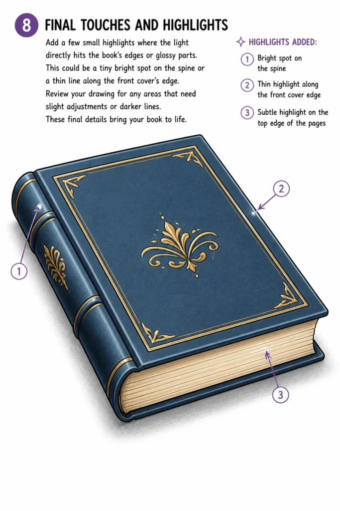
This could be a tiny bright spot on the spine or a thin line along the front cover’s edge.
Review your drawing for any areas that need slight adjustments or darker lines.
These final details bring your book to life.
Common Mistakes to Avoid
Flat Perspective
Many beginners draw a book as two flat rectangles connected, ignoring the rules of perspective.
This makes the book look like a cardboard cutout rather than a solid object.
Always remember that lines receding into the distance should converge, even subtly, to create a convincing three-dimensional form.
Inconsistent Line Weight
Using the same pressure for all lines can make a drawing appear dull and lacking depth.
Varying line weight—making lines closer to the viewer darker and thicker, and receding lines lighter—adds visual interest and helps define form.
This technique gives your drawing a professional, finished look.
Ignoring the Spine’s Curve
A book’s spine is rarely perfectly flat and straight, especially if it’s been read.
Forgetting to add a slight curve to the spine makes the book look stiff and unrealistic.
A gentle curve adds organic realism and suggests the book’s natural flexibility.
Lack of Shading or Poor Shading
A drawing without shading appears flat, no matter how good the outlines are.
Poorly applied shading, without a clear light source, can also confuse the viewer about the book’s form.
Always establish where the light is coming from and shade consistently to create volume and depth.
Troubleshooting
My Book Looks Lopsided or Skewed
This often happens when your initial guide lines for the rectangles aren’t parallel or your connecting lines for depth aren’t quite right.
Go back to Step 1 and 2. Use a ruler to ensure your initial rectangles have perfectly parallel sides, even if you draw freehand later.
Double-check that the top and bottom edges of your book recede at the same angle.
The Pages Look Like a Solid Block, Not Individual Sheets
If your page lines are too thick, too few, or too dark, they will merge into a single block.
Ensure you’re drawing many very thin, light, and closely spaced lines for the page edges.
These lines should be subtle, suggesting texture rather than being dominant features.
My Shading Makes the Book Look Muddy or Unclear
Muddy shading usually results from pressing too hard in initial layers or not blending smoothly.
Start with the lightest pressure, building up layers gradually.
Use a clean finger, a blending stump, or a tissue to smooth out graphite for an even tone.
Remember to leave some areas pure white for highlights to maintain contrast and clarity.
Key Takeaways
- Always start with basic geometric shapes as your foundation.
- Understanding basic perspective is crucial for drawing three-dimensional objects.
- Vary your line weight to add depth and visual interest to your drawing.
- Don’t forget the subtle details like a curved spine and textured pages.
- Shading is essential for creating form, volume, and a sense of realism.
- Practice regularly to improve your hand-eye coordination and artistic confidence.
Frequently Asked Questions
What are the best materials for drawing books?
You only need a few basic tools to start: a graphite pencil (HB or 2B are good all-round choices), an eraser (kneaded or vinyl), and good quality drawing paper.
A ruler can be helpful for initial guide lines, but isn’t strictly necessary once you’re comfortable.
How do I draw an open book?
Drawing an open book involves a different set of initial shapes.
You’ll start with a V-shape for the open pages, then add thickness for the covers extending outwards.
Focus on the curve of the pages and the bend of the spine as key elements.
Can I draw a stack of books using these steps?
Absolutely! Once you master drawing a single book, you can stack them.
Draw each book individually, considering how they overlap and cast shadows on each other.
Pay close attention to the perspective of each book in the stack to maintain realism.
How can I make my book drawings more unique?
Experiment with different cover designs, textures, and even wear and tear.
Add torn pages, bent corners, or a unique title in a distinct font.
Vary the size and proportion of your books to create a diverse collection.
Our Top Recommended Finds
- Sketchbook with Quality Paper: A good sketchbook prevents bleed-through and holds graphite well, making your drawings look crisp.
- Graphite Pencil Set: A set with varying hardness (e.g., 2H, HB, 2B, 4B) allows for a wider range of tones and line weights.
- Kneaded Eraser: Essential for precise erasing and lifting graphite without damaging your paper or smudging your work.
Your Next Chapter in Drawing Begins Now
You’ve successfully drawn a book, transforming simple lines into a three-dimensional object.
This exercise has honed your understanding of form, perspective, and shading.
Don’t stop here; the world of drawing is vast and waiting for your exploration.
Try drawing books from different angles, or challenge yourself by drawing an open book or a pile of books.
Grab your pencil, find a quiet spot, and let your creativity flow onto the page today.
& Painting
No rigid rules or pretension. Just practical guides, medium comparisons, and encouraging tips to help you enjoy the drawing & painting process.