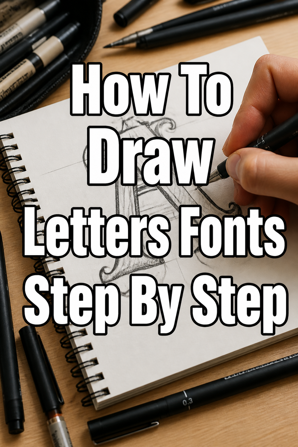
✍️ How To Draw Letters Fonts Step By Step
& Painting
No rigid rules or pretension. Just practical guides, medium comparisons, and encouraging tips to help you enjoy the drawing & painting process.
I remember spending countless hours in my sketchbook, trying to make letters look just right. It felt daunting at first, but with a structured approach, the process became incredibly rewarding. This guide shares the practical steps I learned along the way, helping you create beautiful letterforms from scratch.
You don’t need to be a professional artist to start drawing your own letter fonts. With a little patience and the right techniques, you can bring your unique typographic ideas to life. Let’s get started on this creative journey together.
Quick Overview
This guide will walk you through the entire process of conceptualizing, sketching, and refining your own unique letter fonts. You’ll learn the foundational skills needed to draw consistent and appealing letterforms.
- Time needed: 2-4 hours for a basic alphabet, ongoing practice for mastery
- Difficulty: Beginner
- What you’ll need: Pencil, paper, eraser, ruler, inspiration
Step-by-Step Instructions
Step 1: Gather Your Essential Tools
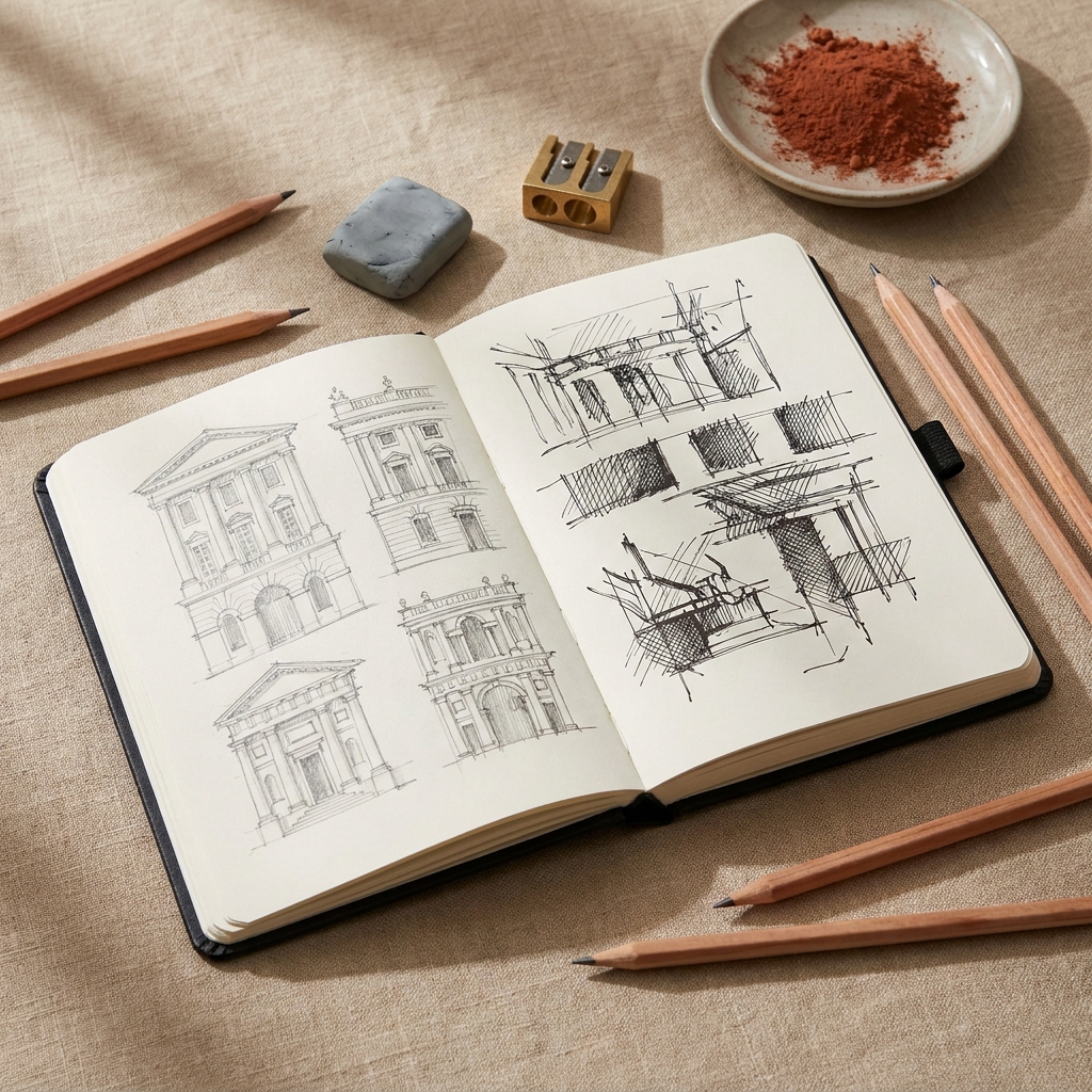
Before you begin, make sure you have the right supplies. Simple tools are often the best for starting out.
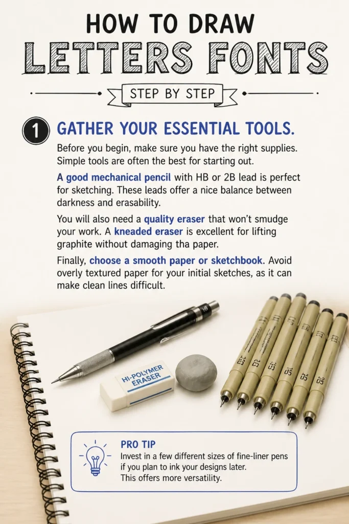
A good mechanical pencil with HB or 2B lead is perfect for sketching. These leads offer a nice balance between darkness and erasability.
You will also need a quality eraser that won’t smudge your work. A kneaded eraser is excellent for lifting graphite without damaging the paper.
Finally, choose a smooth paper or sketchbook. Avoid overly textured paper for your initial sketches, as it can make clean lines difficult.
Pro Tip: Invest in a few different sizes of fine-liner pens if you plan to ink your designs later. This offers more versatility.
Step 2: Find Your Inspiration and Define Your Style
Drawing letters isn’t just about lines; it’s about conveying a mood or message. Begin by thinking about the feeling you want your font to evoke.
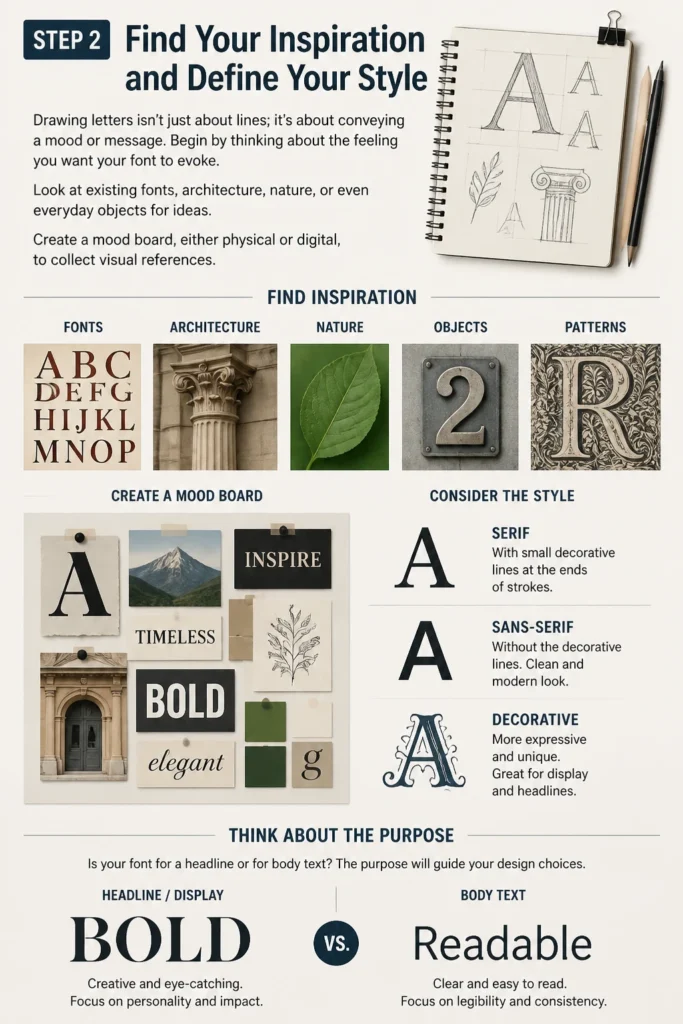
Look at existing fonts, architecture, nature, or even everyday objects for ideas. Create a mood board, either physical or digital, to collect visual references.
Consider whether you want a serif font (with small decorative lines at the ends of strokes), a sans-serif font (without them), or something more decorative. Think about the purpose of your font; is it for a headline or body text?
Step 3: Sketch Basic Letter Shapes and Structure
Start by drawing simple guidelines on your paper. These include a baseline (where letters sit), an x-height (the height of lowercase letters like ‘x’), a cap height (for uppercase letters), and ascender/descender lines.
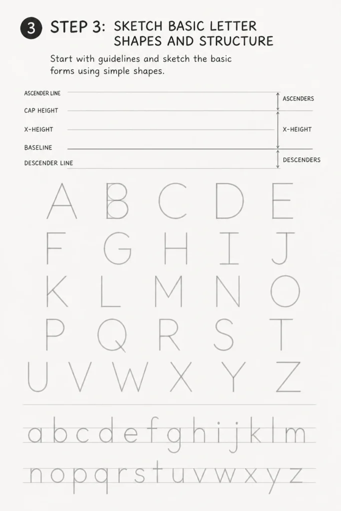
Lightly sketch the most basic forms of your letters. Focus on the core structure first, using simple geometric shapes like squares, circles, and triangles as a foundation.
For example, a capital ‘O’ starts as a simple oval, and an ‘I’ is just a vertical line. Don’t worry about perfection at this stage; this is about rough composition.
Step 4: Refine Outlines and Add Thickness
Once the basic shapes are down, begin to add thickness to your letter strokes. This is where you start defining the “weight” of your font.
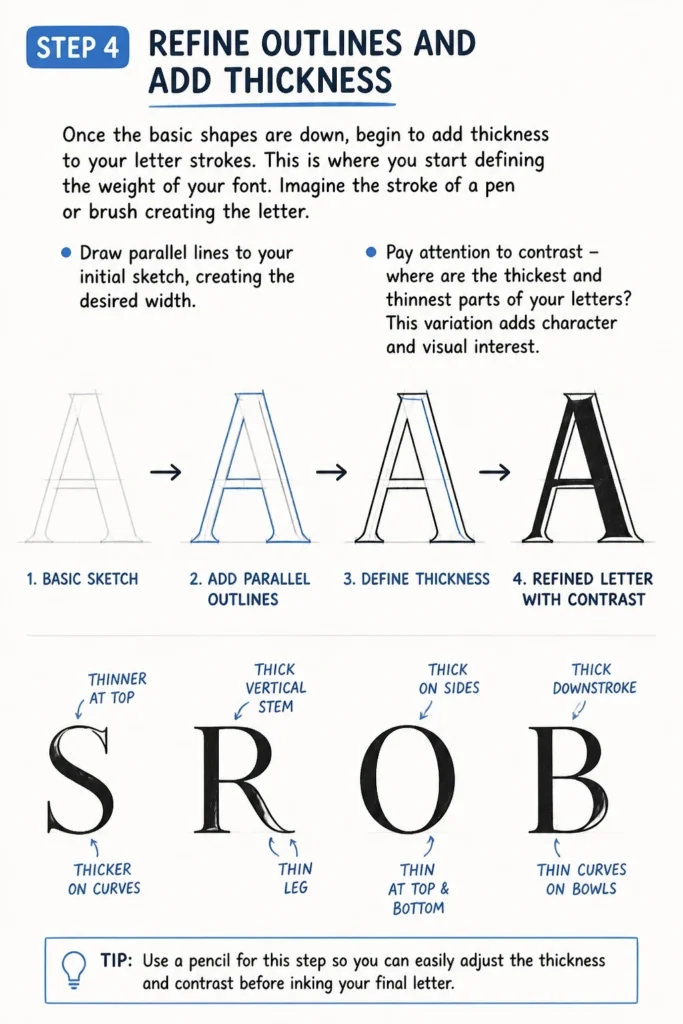
Imagine the stroke of a pen or brush creating the letter. Draw parallel lines to your initial sketch, creating the desired width.
Pay attention to contrast: where are the thickest and thinnest parts of your letters? This variation adds character and visual interest.
Step 5: Focus on Spacing and Kerning
Consistent spacing between letters, known as kerning, is crucial for readability and aesthetics. Bad spacing can make even the most beautiful letters look amateurish.
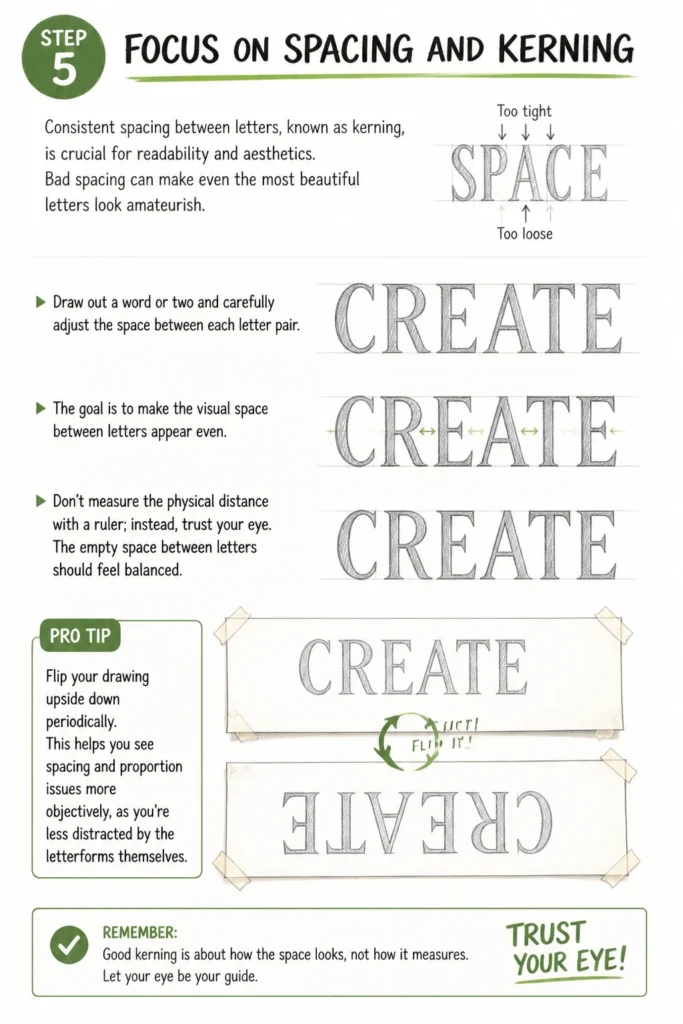
Draw out a word or two and carefully adjust the space between each letter pair. The goal is to make the visual space between letters appear even.
Don’t measure the physical distance with a ruler; instead, trust your eye. The empty space between letters should feel balanced.
Pro Tip: Flip your drawing upside down periodically. This helps you see spacing and proportion issues more objectively, as you’re less distracted by the letterforms themselves.
Step 6: Add Details, Serifs, and Embellishments
Now is the time to introduce the unique elements that define your font’s style. If it’s a serif font, carefully draw the small feet at the end of strokes.
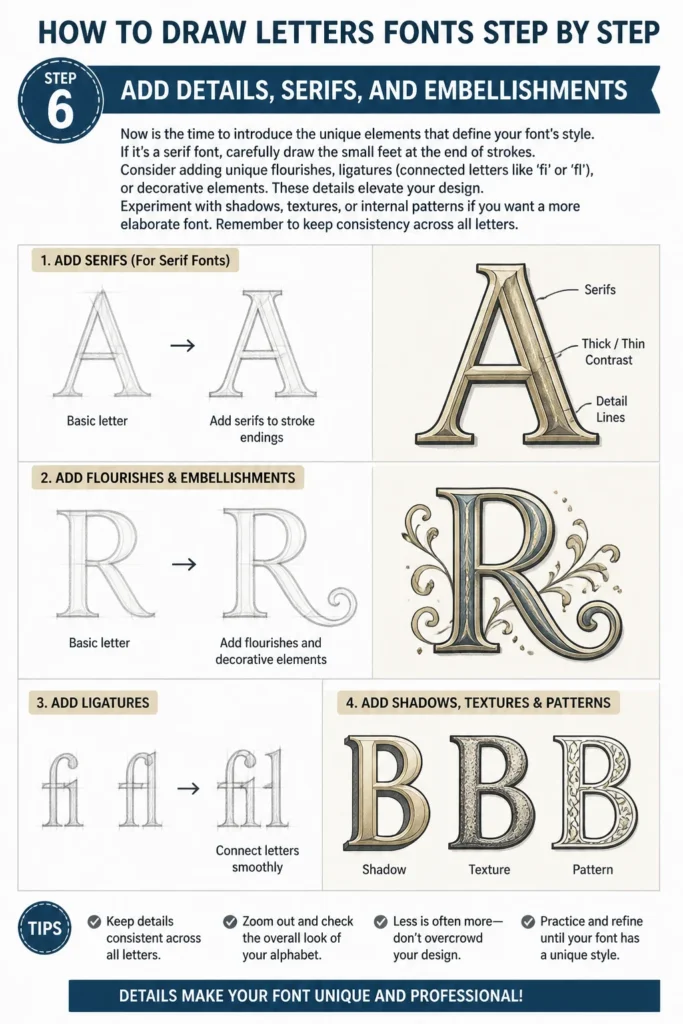
Consider adding unique flourishes, ligatures (connected letters like ‘fi’ or ‘fl’), or decorative elements. These details elevate your design.
Experiment with shadows, textures, or internal patterns if you want a more elaborate font. Remember to keep consistency across all letters.
Step 7: Ensure Consistency Across the Alphabet
A strong font maintains visual harmony across all its characters. Review your entire alphabet for consistency in stroke weight, curve angles, and overall height.
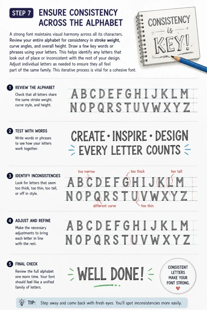
Draw a few key words or phrases using your letters. This helps identify any letters that look out of place or inconsistent with the rest of your design.
Adjust individual letters as needed to ensure they all feel part of the same family. This iterative process is vital for a cohesive font.
Step 8: Clean Up Your Drawing and Digitize (Optional)
Once you’re happy with your pencil sketches, carefully ink your letters using fine-liner pens. Take your time to create crisp, clean lines.
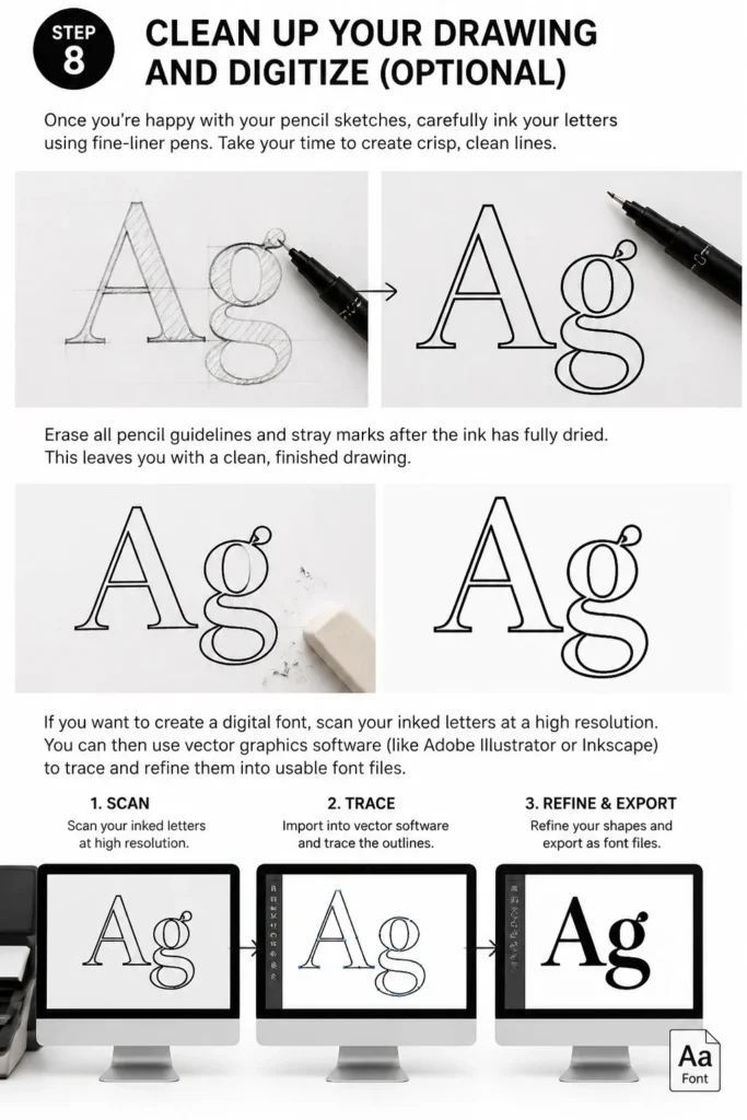
Erase all pencil guidelines and stray marks after the ink has fully dried. This leaves you with a clean, finished drawing.
If you want to create a digital font, scan your inked letters at a high resolution. You can then use vector graphics software (like Adobe Illustrator or Inkscape) to trace and refine them into usable font files.
Common Mistakes to Avoid
Inconsistent Spacing
Many beginners focus solely on individual letterforms and neglect the space between them. This leads to words that look choppy and hard to read. Always view your letters in context, drawing full words to assess and adjust the kerning.
Ignoring Basic Anatomy
Each letter has a specific structure and set of rules, even in decorative fonts. Forgetting about x-heights, baselines, and consistent stroke widths can make your font appear unprofessional. Always use guidelines and refer to established typographic principles as you sketch.
Over-Complication Too Early
It’s tempting to jump straight to elaborate flourishes and intricate details. However, this often results in a messy or unbalanced design if the foundational structure isn’t solid. Master the basic letterforms and their relationships first, then gradually introduce embellishments.
Rushing the Process
Drawing a complete, consistent alphabet takes time and patience. Don’t expect to finish a polished font in a single sitting. Break the process into smaller, manageable steps and take breaks. Rushing leads to sloppy lines and inconsistent designs.
Troubleshooting
Letters Look Wobbly or Uneven
This often happens when drawing freehand without enough guidance. Try using more robust guidelines, including horizontal lines for x-height, cap height, and baseline, as well as vertical lines to help maintain straightness. Practice drawing long, confident strokes rather than many short, hesitant ones. Use a ruler for initial structural lines, then refine by hand.
Can’t Get Letters to Match
Lack of consistency is a common hurdle. To fix this, create a “master” letter or two (like ‘n’ and ‘o’) that embody your desired style. Then, use these as references for all other letters, ensuring similar curve angles, stroke weights, and terminal shapes. Drawing the entire alphabet on a single sheet of paper can also help you visually compare and adjust.
Feeling Stuck or Uninspired
Creative blocks are normal. Step away from your project for a while. Look for inspiration in completely different fields, like architecture, fashion, or nature. Try drawing letters in a completely new style just for fun, without any pressure. Sometimes, a fresh perspective is all you need to reignite your creativity.
Key Takeaways
- Gathering basic tools like pencils and good paper is the first practical step.
- Finding inspiration and defining your font’s purpose guides your design choices.
- Start with basic letter structures and guidelines to ensure consistency.
- Refining outlines and managing stroke thickness defines your font’s weight.
- Prioritize consistent spacing (kerning) for readability and visual appeal.
- Add unique details and embellishments once the core structure is solid.
- Always check for consistency across your entire alphabet.
- Practice and patience are essential for improving your letter drawing skills.
Frequently Asked Questions
What’s the difference between a font and a typeface?
A typeface is the overall design of the letters, like Arial or Times New Roman. A font refers to a specific style and size within that typeface, such as Arial Bold 12pt. In everyday language, the terms are often used interchangeably, but it’s good to know the distinction.
How do I choose a style for my first font?
Start with something simple, like a basic sans-serif or a blocky display font. These styles are often more forgiving and easier to maintain consistency with. As you gain confidence, you can explore more complex serifs, scripts, or decorative styles.
Can I use my hand-drawn fonts commercially?
Yes, absolutely! Many professional fonts start as hand-drawn sketches. If you digitize your font, you can create a font file that can be used in design software. Just ensure your design is original and doesn’t infringe on existing copyrighted typefaces.
How often should I practice to get better?
Consistency is key. Even 15-30 minutes of practice a few times a week is more beneficial than one long session once a month. Focus on different letters, words, and styles to keep your practice engaging and challenging.
Our Top Recommended Finds
- Moleskine Art Sketchbook: The smooth, acid-free paper is excellent for pencil and ink work, preventing bleed-through.
- Sakura Pigma Micron Fineliner Pen Set: These pens offer consistent ink flow and come in various tip sizes, perfect for detailed inking.
- Pentel GraphGear 500 Mechanical Pencil: A durable pencil with a comfortable grip, ideal for precise sketching and long drawing sessions.
Your Letters, Your Legacy
Drawing letters is a journey of creativity and precision. Each stroke you make builds not just a character, but a piece of your unique artistic voice. Don’t be afraid to experiment, make mistakes, and learn from every line.
Now that you have the steps, pick up your pencil and start sketching. The world is waiting to see the beautiful letterforms you’ll create. What will your first word be?
& Painting
No rigid rules or pretension. Just practical guides, medium comparisons, and encouraging tips to help you enjoy the drawing & painting process.