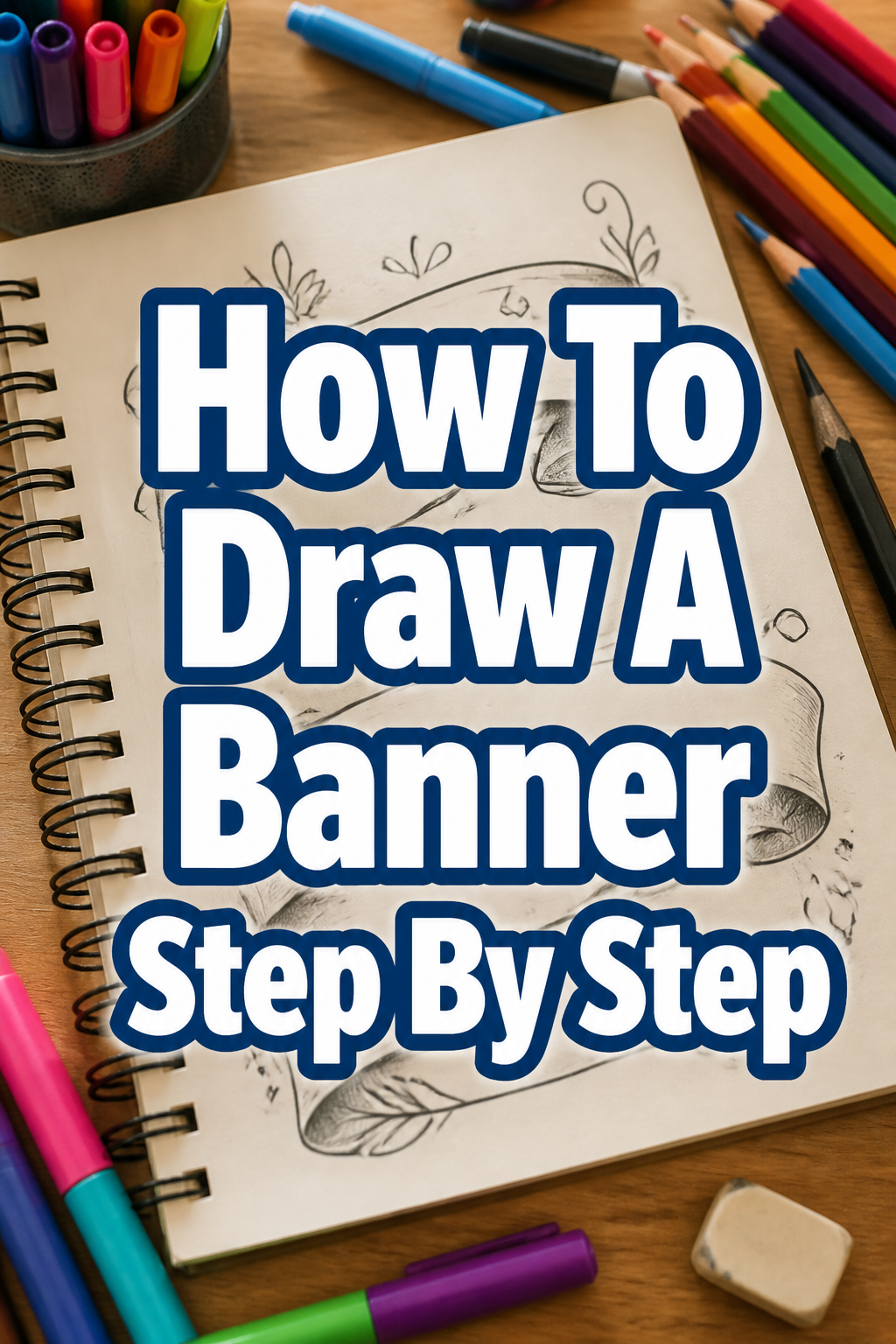
🎨 How To Draw A Banner Step By Step
& Painting
No rigid rules or pretension. Just practical guides, medium comparisons, and encouraging tips to help you enjoy the drawing & painting process.
Learning to draw a banner adds a lovely touch to any project.
It can elevate your journal entries, personalize greeting cards, or make your notes truly stand out.
I’ve personally used banners for everything from party invitations to organizing my creative thoughts, and I’m excited to share my go-to method with you.
Quick Overview
This guide will walk you through creating a classic, elegant banner from scratch.
You’ll finish with a versatile banner drawing ready for text or additional designs.
- Time needed: 30-60 minutes
- Difficulty: Beginner
- What you’ll need: Pencil (HB or 2B), eraser, ruler, paper, fine-liner pen, optional: colored pencils or markers
Step-by-Step Instructions
Step 1: Gather Your Materials and Prepare Your Space
Before you begin, ensure you have all your drawing tools within reach.
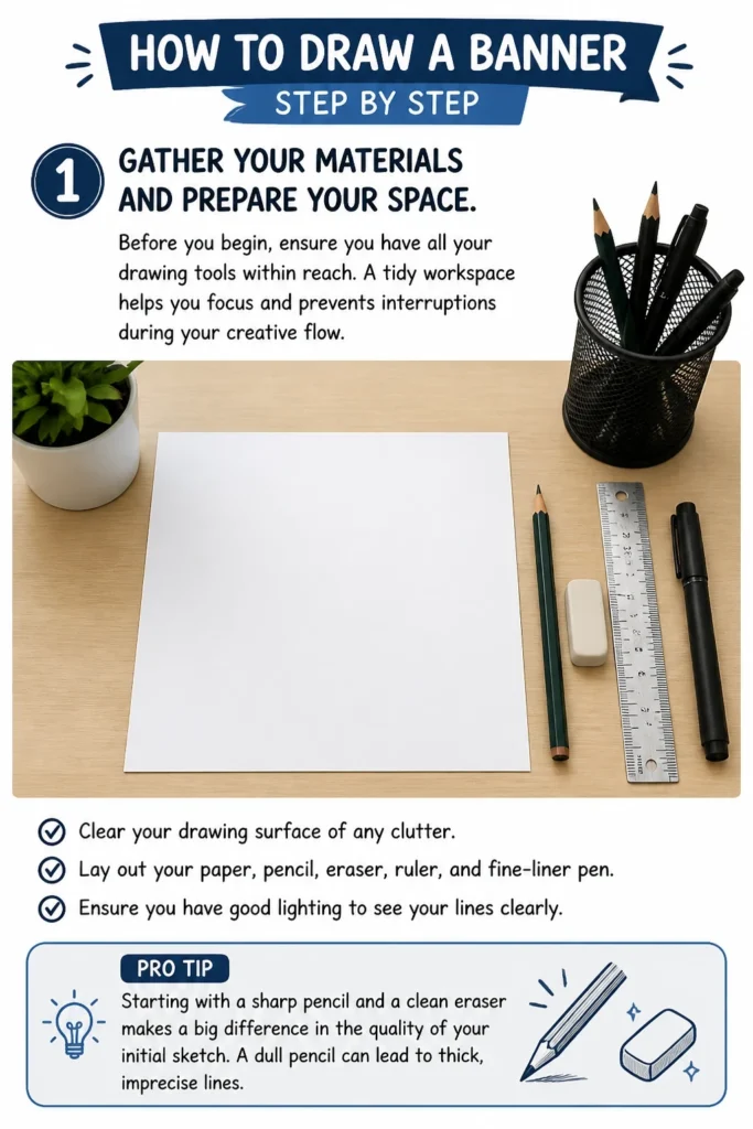
A tidy workspace helps you focus and prevents interruptions during your creative flow.
Clear your drawing surface of any clutter.
Lay out your paper, pencil, eraser, ruler, and fine-liner pen.
Ensure you have good lighting to see your lines clearly.
Pro Tip: Starting with a sharp pencil and a clean eraser makes a big difference in the quality of your initial sketch. A dull pencil can lead to thick, imprecise lines.
Step 2: Lightly Sketch the Main Body of the Banner
The main body is the central rectangle where your text or design will go.
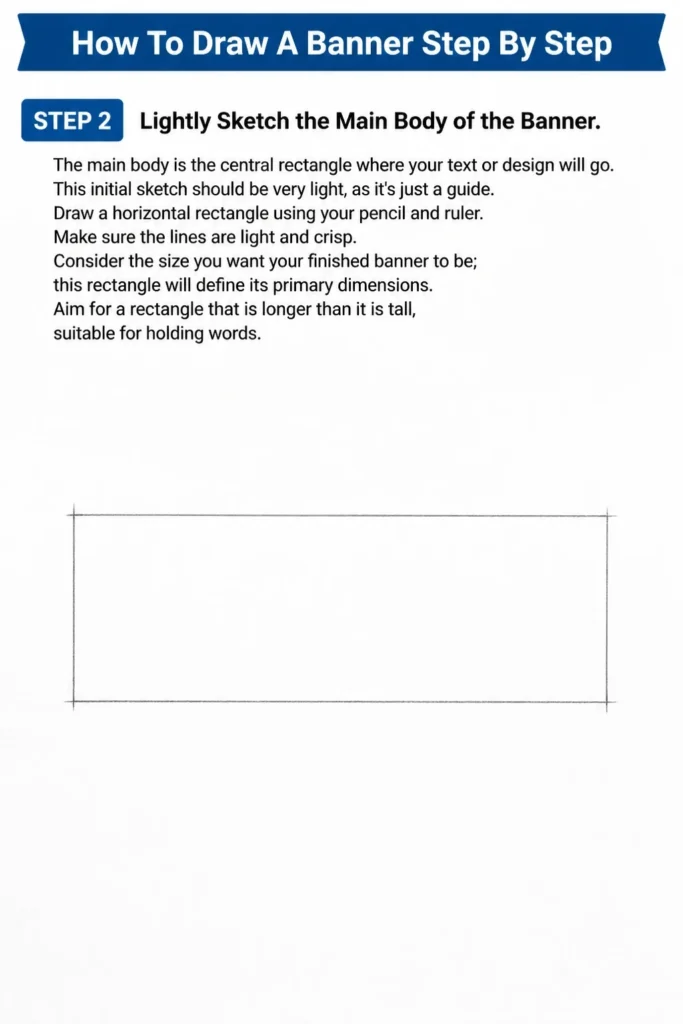
This initial sketch should be very light, as it’s just a guide.
Draw a horizontal rectangle using your pencil and ruler.
Make sure the lines are light and crisp.
Consider the size you want your finished banner to be; this rectangle will define its primary dimensions.
Aim for a rectangle that is longer than it is tall, suitable for holding words.
Step 3: Add the Side Flaps or “Swallowtails”
These are the distinctive ends that give a banner its classic look.
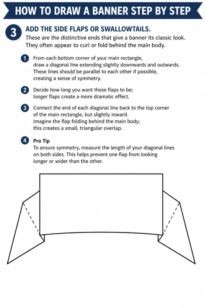
They often appear to curl or fold behind the main body.
From each bottom corner of your main rectangle, draw a diagonal line extending slightly downwards and outwards.
These lines should be parallel to each other if possible, creating a sense of symmetry.
Decide how long you want these flaps to be; longer flaps create a more dramatic effect.
Connect the end of each diagonal line back to the top corner of the main rectangle, but slightly inward.
Imagine the flap folding behind the main body; this creates a small, triangular overlap.
Pro Tip: To ensure symmetry, measure the length of your diagonal lines on both sides. This helps prevent one flap from looking longer or wider than the other.
Step 4: Create the Illusion of Folds and Depth
This step adds dimension, making your banner look like a piece of fabric rather than a flat shape.
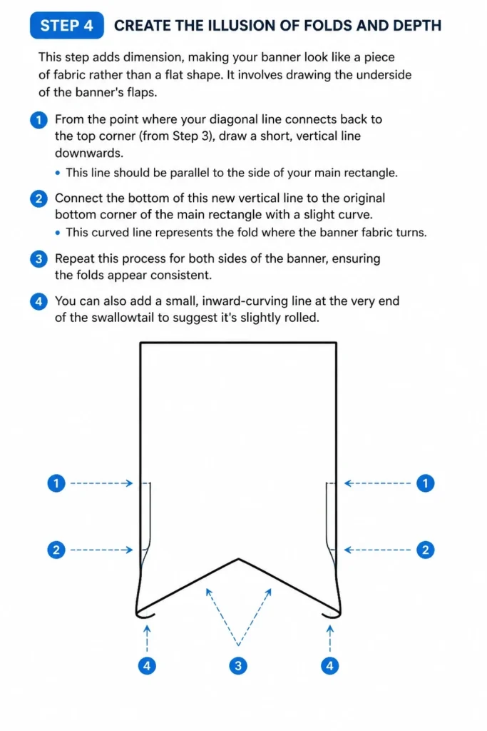
It involves drawing the “underside” of the banner’s flaps.
From the point where your diagonal line connects back to the top corner (from Step 3), draw a short, vertical line downwards.
This line should be parallel to the side of your main rectangle.
Connect the bottom of this new vertical line to the original bottom corner of the main rectangle with a slight curve.
This curved line represents the fold where the banner fabric turns.
Repeat this process for both sides of the banner, ensuring the folds appear consistent.
You can also add a small, inward-curving line at the very end of the swallowtail to suggest it’s slightly rolled.
Step 5: Refine the Lines and Erase Unnecessary Guides
Now that the basic structure is complete, it’s time to clean up your sketch.
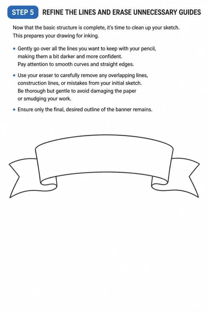
This prepares your drawing for inking.
Gently go over all the lines you want to keep with your pencil, making them a bit darker and more confident.
Pay attention to smooth curves and straight edges.
Use your eraser to carefully remove any overlapping lines, construction lines, or mistakes from your initial sketch.
Be thorough but gentle to avoid damaging the paper or smudging your work.
Ensure only the final, desired outline of the banner remains.
Step 6: Ink the Banner Outline
Inking makes your banner permanent and gives it a crisp, professional finish.
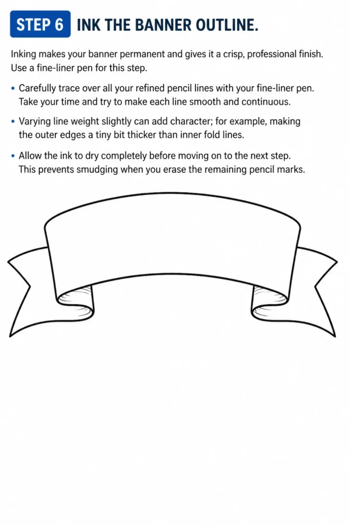
Use a fine-liner pen for this step.
Carefully trace over all your refined pencil lines with your fine-liner pen.
Take your time and try to make each line smooth and continuous.
Varying line weight slightly can add character; for example, making the outer edges a tiny bit thicker than inner fold lines.
Allow the ink to dry completely before moving on to the next step.
This prevents smudging when you erase the remaining pencil marks.
Step 7: Erase All Remaining Pencil Marks
Once the ink is fully dry, it’s crucial to remove all the underlying pencil lines.
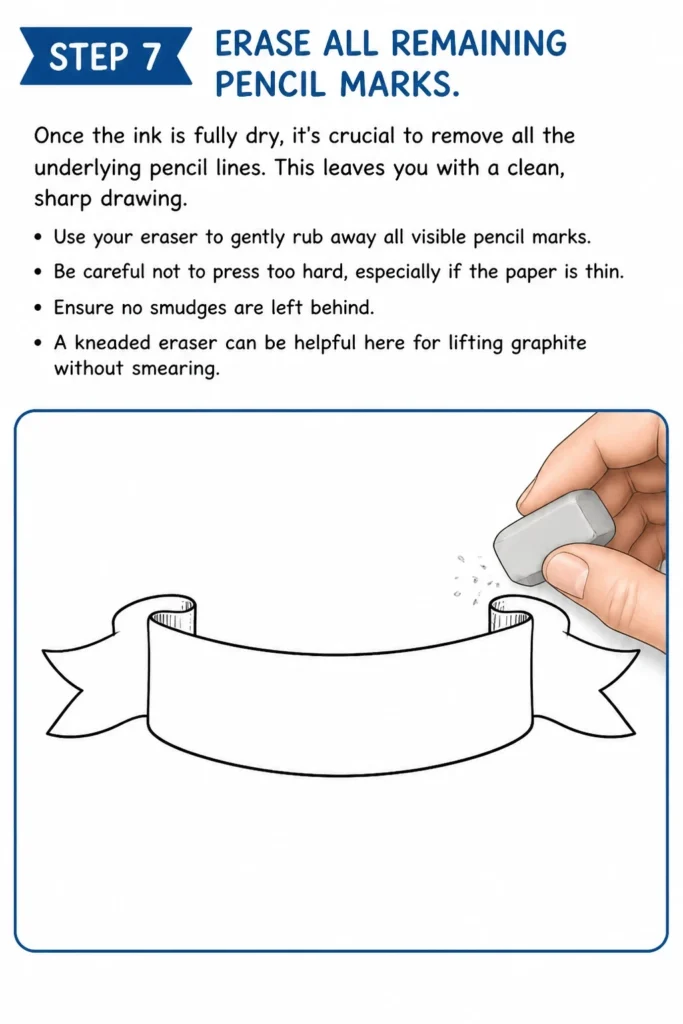
This leaves you with a clean, sharp drawing.
Use your eraser to gently rub away all visible pencil marks.
Be careful not to press too hard, especially if the paper is thin.
Ensure no smudges are left behind.
A kneaded eraser can be helpful here for lifting graphite without smearing.
Step 8: Add Text, Color, and Shading (Optional but Recommended)
This is where your banner truly comes to life and expresses its purpose.
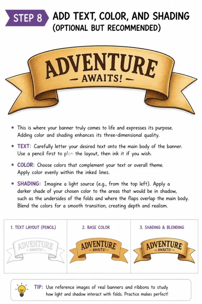
Adding color and shading enhances its three-dimensional quality.
Carefully letter your desired text onto the main body of the banner.
Use a pencil first to plan the layout, then ink it if you wish.
Choose colors that complement your text or overall theme.
Apply color evenly within the inked lines.
To add shading, imagine a light source (e.g., from the top left).
Apply a darker shade of your chosen color to the areas that would be in shadow, such as the undersides of the folds and where the flaps overlap the main body.
Blend the colors for a smooth transition, creating depth and realism.
Common Mistakes to Avoid
Uneven Sides or Asymmetry
A common pitfall is having one side of your banner look different from the other.
This can make the entire drawing appear off-balance and unprofessional.
Always use a ruler for your initial rectangular shape and for measuring the length and angle of your side flaps.
Take an extra moment to visually check for symmetry before inking.
Flat, Two-Dimensional Appearance
Without proper folds and shading, a banner can look like a simple, flat shape.
This misses the opportunity to give it a dynamic, fabric-like quality.
Remember to draw the “underside” of the flaps and consider where shadows would naturally fall to create the illusion of depth.
Rushing the Inking or Erasing
Impatience during these crucial steps can lead to smudges or messy lines.
Rushing the inking can result in wobbly lines, while erasing too soon can smear wet ink.
Always allow ample drying time for your ink before erasing, and use a light touch when erasing pencil lines.
Disproportionate Text or Design
Trying to fit too much text or a design that’s too large or small for the banner can ruin its aesthetic.
The banner should frame its content, not be overwhelmed by it.
Sketch your text lightly in pencil first to ensure it fits well within the banner’s main body before committing to ink or color.
Troubleshooting
My Banner Looks Wonky or Not Symmetrical
This is often due to freehand drawing without enough guidance or rushed measurements.
Go back to Step 2 and 3, focusing on your ruler.
Measure the height of your main rectangle, and then ensure the length of your diagonal flap lines are identical on both sides.
It helps to draw a faint central vertical guideline through your main rectangle to check symmetry.
I Can’t Get the Folds to Look Right
The folds are key to depth, and they can be tricky.
Try looking at reference images of banners or ribbons online to understand how light and shadow play on folds.
Practice drawing just the fold sections repeatedly on a scrap piece of paper until you feel more comfortable with the curves and angles.
Start with very simple, straight folds before attempting more complex ones.
My Coloring Looks Flat and Uninteresting
Flat coloring usually means you’re using only one shade for an entire section.
To add dimension, you need to introduce at least two shades of the same color: a base color and a darker shade for shadows.
Identify your imaginary light source and apply the darker shade to areas that would be away from the light, such as the undersides of folds or the areas where the banner overlaps.
Blending these shades smoothly makes a huge difference.
Key Takeaways
- Start Light: Always begin your drawing with a very light pencil sketch that can be easily erased.
- Use Your Tools: A ruler is your best friend for achieving straight lines and symmetry.
- Build in Layers: Construct the banner step by step, from the main body to the flaps, then the folds.
- Add Depth with Folds and Shading: These elements transform a flat shape into a dynamic, realistic banner.
- Patience is Key: Take your time, especially during inking and coloring, for a clean and polished final result.
- Practice Makes Perfect: The more you draw banners, the more natural and effortless the process will become.
Frequently Asked Questions
What’s the best type of paper for drawing banners?
For beginners, a smooth, slightly thicker drawing paper (like Bristol board or even good quality printer paper) works well. It handles erasing better and prevents ink from bleeding through. As you advance, you might explore watercolor paper if you plan to use wet media.
How can I make my banner look more three-dimensional?
The key to a 3D look lies in two main aspects: accurate folds and effective shading. Ensure you draw the “underside” of the banner flaps where they fold behind the main body. Then, apply darker shades of color to these folded areas and any parts that would naturally be in shadow, creating contrast and depth.
Can I draw different banner shapes?
Absolutely! This guide covers a classic swallowtail banner, but the principles apply to many shapes. You can experiment with wavy banners, banners with pointed ends, or even banners that loop and twist. Start with a basic shape and then apply the concepts of folds and overlaps to add dimension.
How do I choose the right font for my banner text?
The best font depends on the banner’s purpose. For a formal look, try a serif font. For something playful, a script or bubble font might work. Ensure the font is legible and complements the overall style of your banner. Sketch it lightly first to check spacing and size.
Our Top Recommended Finds
- Sketchbook with Quality Paper: A good sketchbook provides a dedicated space for practice and finished pieces, with paper that can withstand erasing and ink.
- Set of Fine-Liner Pens: Various tip sizes allow for different line weights, adding detail and professionalism to your inked drawings.
- Dual-Tip Alcohol Markers: These markers offer vibrant, blendable colors for smooth shading and a professional finish to your colored banners.
Your Creative Journey Starts Now
You now have the tools and knowledge to draw a beautiful banner.
This simple skill opens up a world of creative possibilities for your art and personal projects.
Don’t stop here; try drawing banners with different shapes, adding unique flourishes, or incorporating them into larger scenes.
Grab your pencil and start creating your first banner today!
& Painting
No rigid rules or pretension. Just practical guides, medium comparisons, and encouraging tips to help you enjoy the drawing & painting process.