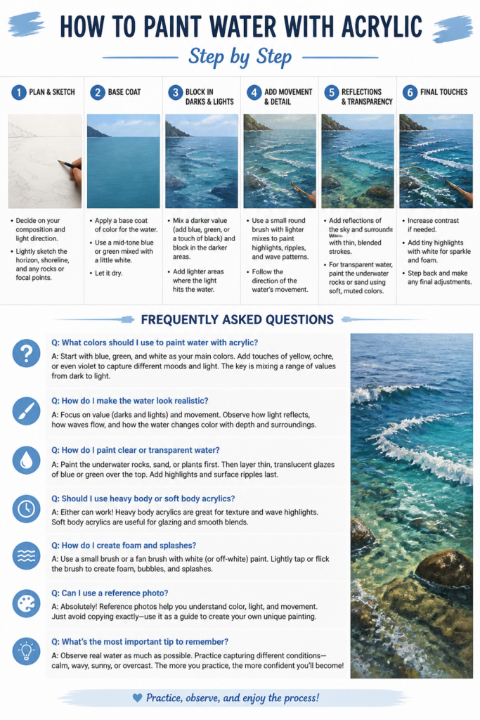
🌊 How To Paint Water With Acrylic Step By Step
Painting water can seem daunting, with its endless variations of light, reflection, and movement. Many artists struggle to capture its elusive beauty on canvas. I understand this challenge firsthand, having spent countless hours at the easel, experimenting with acrylics to mimic water’s dynamic nature.
This guide distills years of practice and observation into actionable steps. You’ll gain practical insights and techniques to bring your painted waterscapes to life. Trust in these methods to transform your approach to painting this captivating element.
Quick Overview
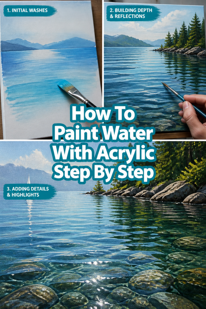
This guide will walk you through creating realistic and vibrant water scenes using acrylic paints. You’ll learn how to build depth, capture reflections, and suggest movement effectively. By the end, you’ll have a solid foundation for painting various types of water.
- Time needed: 2-4 hours (depending on detail and drying time)
- Difficulty: Intermediate
- What you’ll need: Acrylic paints (various blues, greens, white, black, brown, raw sienna), canvas or art board, variety of brushes (flat, round, liner), palette, water container, paper towels, reference photo.
Step-by-Step Instructions
Step 1: Gather Your Materials and Reference
Before dipping your brush, ensure you have everything within reach. A well-organized workspace makes the painting process smoother and more enjoyable. This preparation saves time and prevents interruptions later on.
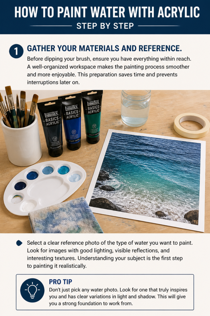
Select a clear reference photo of the type of water you want to paint. Look for images with good lighting, visible reflections, and interesting textures. Understanding your subject is the first step to painting it realistically.
Pro Tip: Don’t just pick any water photo. Look for one that truly inspires you and has clear variations in light and shadow. This will give you a strong foundation to work from.
Step 2: Sketch Your Composition
Lightly sketch the main elements of your scene onto your canvas using a pencil or a very diluted light-colored acrylic. Focus on the horizon line, the general shape of the water body, and any prominent reflections. Keep this sketch loose and minimal.
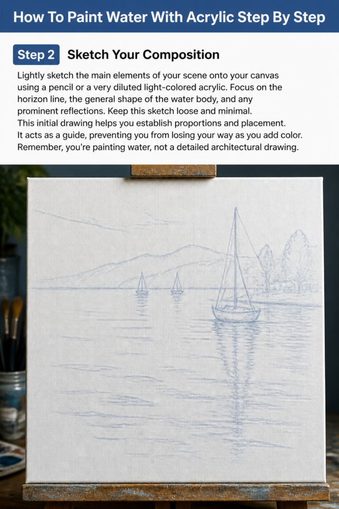
This initial drawing helps you establish proportions and placement. It acts as a guide, preventing you from losing your way as you add color. Remember, you’re painting water, not a detailed architectural drawing.
Step 3: Lay Down the Base Colors
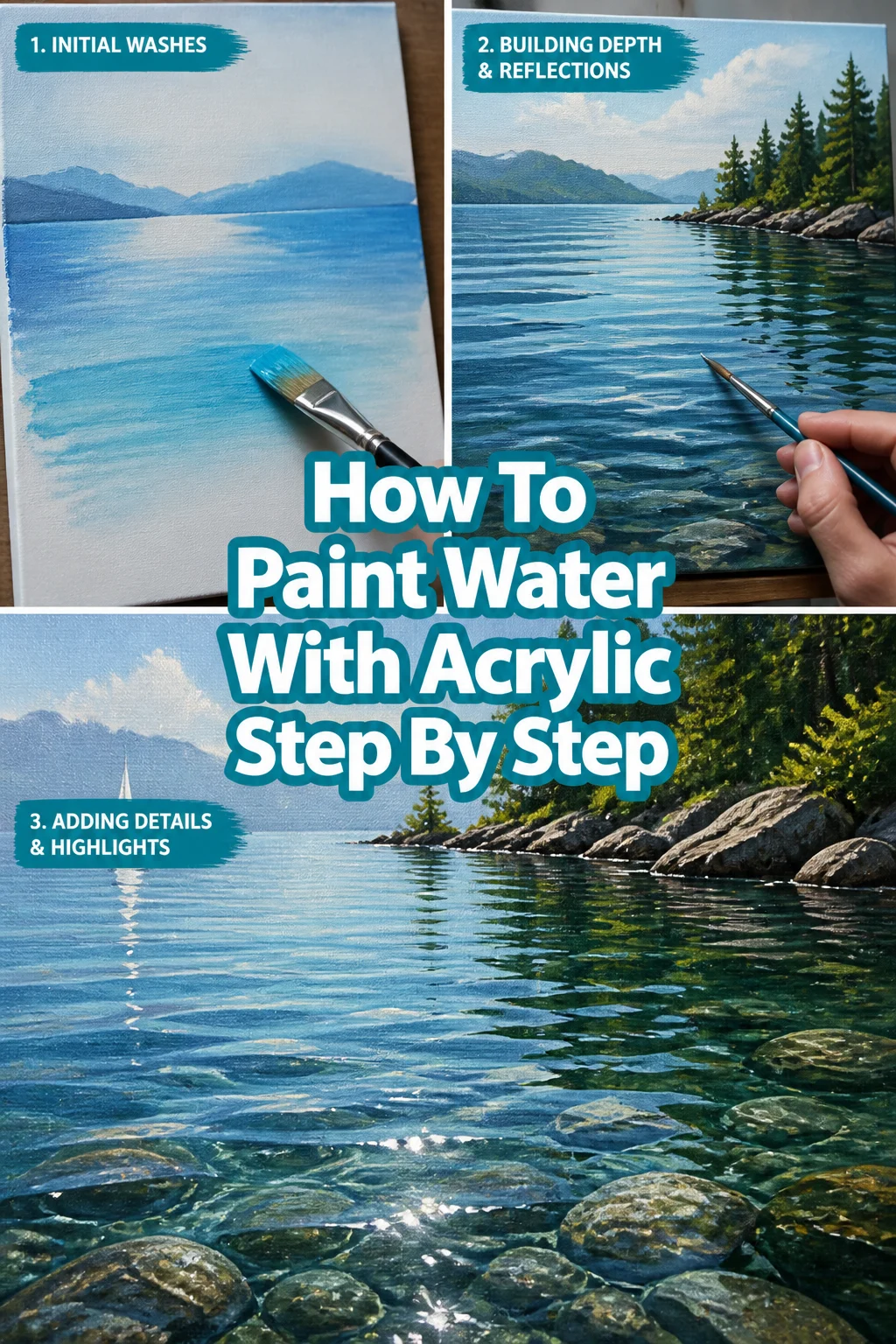
Apply a thin, diluted wash of color for your water’s darkest values first. Mix a dark blue (like Ultramarine Blue) with a touch of Payne’s Gray or a deep green. This wash establishes the underlying tone and shadow areas.
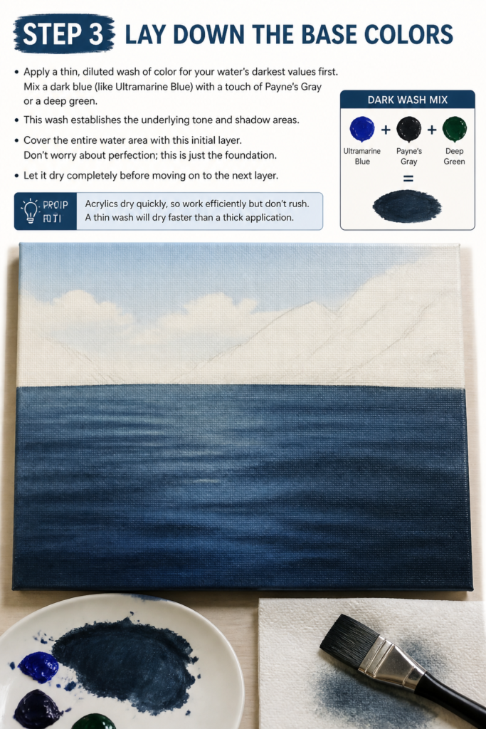
Cover the entire water area with this initial layer. Don’t worry about perfection; this is just the foundation. Let it dry completely before moving on to the next layer.
Pro Tip: Acrylics dry quickly, so work efficiently but don’t rush. A thin wash will dry faster than a thick application.
Step 4: Build Depth with Mid-Tones
Introduce your mid-tone colors. Mix various blues (Cerulean Blue, Phthalo Blue) and greens (Hooker’s Green, Sap Green) with a touch of white or Raw Sienna to create a range of values. Observe your reference photo closely to identify these areas.
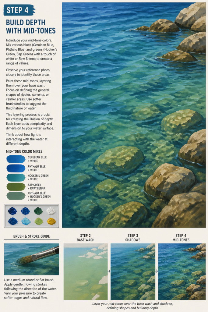
Paint these mid-tones, layering them over your base wash. Focus on defining the general shapes of ripples, currents, or calmer areas. Use softer brushstrokes to suggest the fluid nature of water.
This layering process is crucial for creating the illusion of depth. Each layer adds complexity and dimension to your water surface. Think about how light is interacting with the water at different depths.
Step 5: Add Highlights and Ripples
Begin to add brighter highlights and define smaller ripples. Mix a lighter blue or green with more white. Use a smaller, flat brush or a round brush for these details.
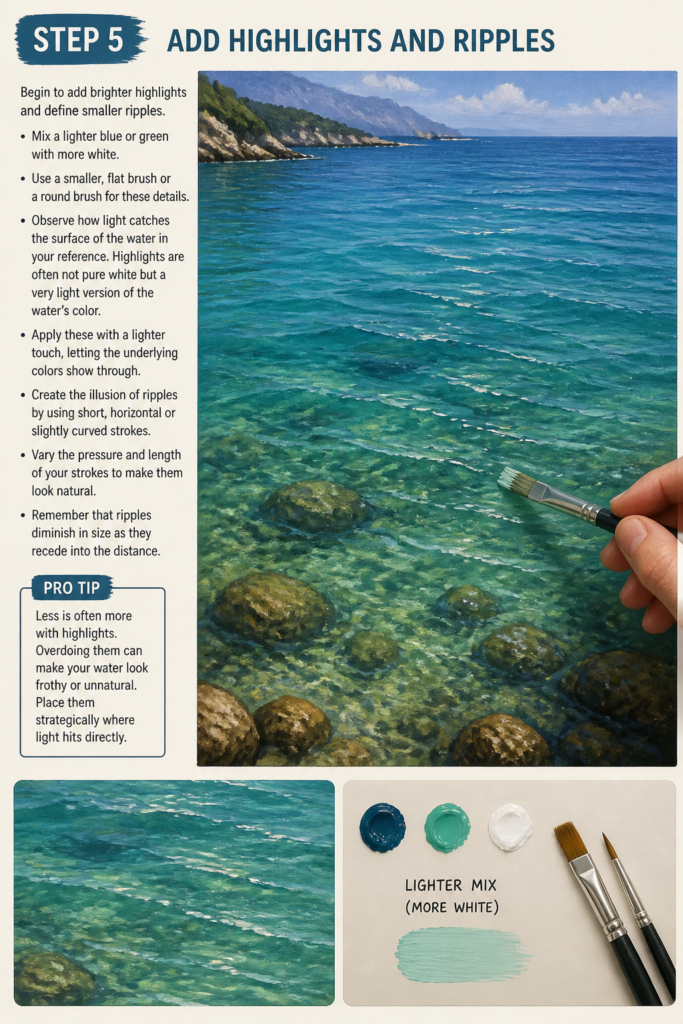
Observe how light catches the surface of the water in your reference. Highlights are often not pure white but a very light version of the water’s color. Apply these with a lighter touch, letting the underlying colors show through.
Create the illusion of ripples by using short, horizontal or slightly curved strokes. Vary the pressure and length of your strokes to make them look natural. Remember that ripples diminish in size as they recede into the distance.
Pro Tip: Less is often more with highlights. Overdoing them can make your water look frothy or unnatural. Place them strategically where light hits directly.
Step 6: Refine Details and Reflections
Focus on painting reflections. Objects above or beside the water will cast reflections onto its surface. These reflections are usually darker, slightly distorted, and follow the contours of the water’s movement.
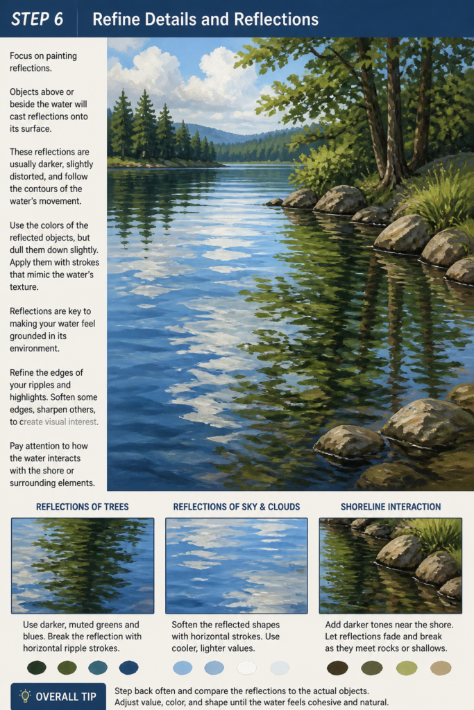
Use the colors of the reflected objects, but dull them down slightly. Apply them with strokes that mimic the water’s texture. Reflections are key to making your water feel grounded in its environment.
Refine the edges of your ripples and highlights. Soften some edges, sharpen others, to create visual interest. Pay attention to how the water interacts with the shore or surrounding elements.
Step 7: Introduce Movement and Texture
Add subtle glazes or thin layers of transparent color to enhance depth and movement. Mix a small amount of your water color with an acrylic glazing medium to create transparent washes. This allows previous layers to show through, adding richness.
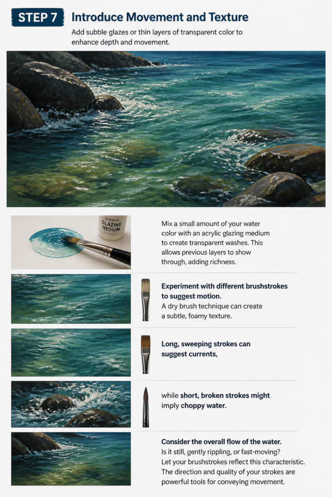
Experiment with different brushstrokes to suggest motion. A dry brush technique can create a subtle, foamy texture. Long, sweeping strokes can suggest currents, while short, broken strokes might imply choppy water.
Consider the overall flow of the water. Is it still, gently rippling, or fast-moving? Let your brushstrokes reflect this characteristic. The direction and quality of your strokes are powerful tools for conveying movement.
Step 8: Apply Finishing Touches and Glazes
Step back from your painting regularly to assess your progress. Identify any areas that need adjustment in color, value, or texture. Sometimes a fresh perspective reveals what needs attention.
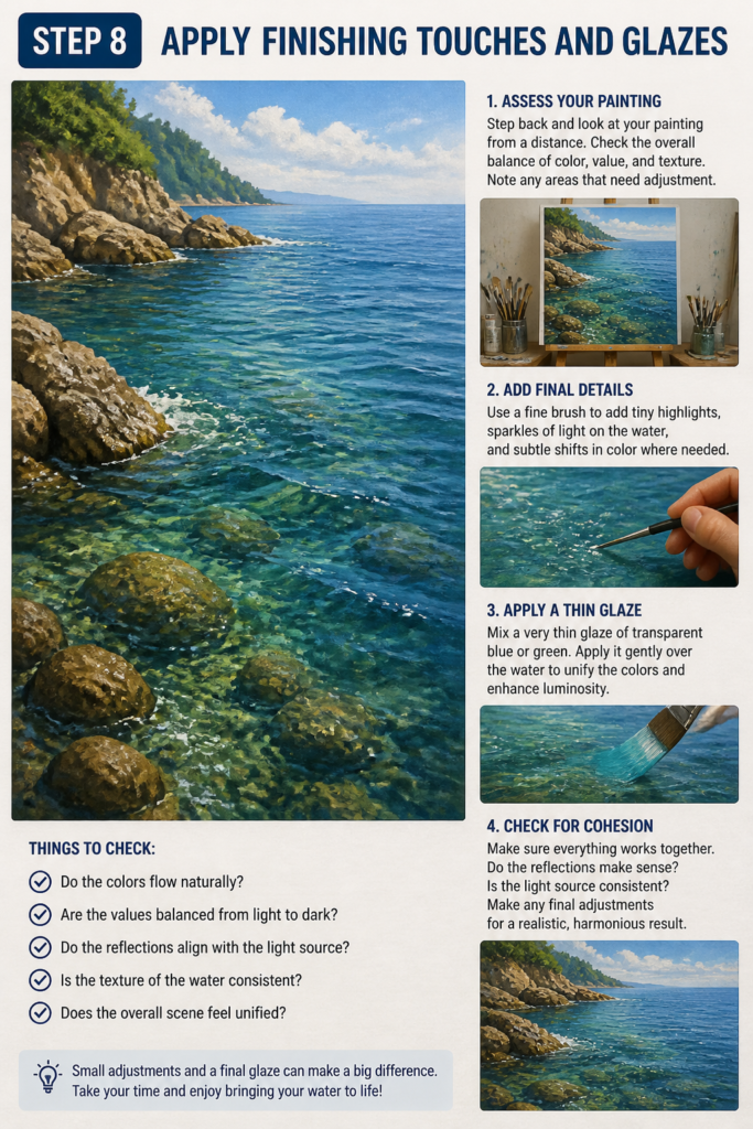
Add any final, small details like tiny sparkles of light or subtle shifts in color. A very thin glaze of a transparent blue or green can unify your water colors and add a luminous quality. This final layer helps to pull everything together.
Ensure all elements within your water scene are cohesive. Do the reflections make sense? Does the light source match? These small adjustments make a big difference in realism.
Common Mistakes to Avoid
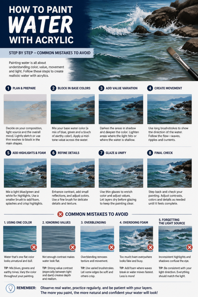
Overworking the Paint
A common pitfall is to keep blending and adding paint, especially when trying to achieve smooth transitions. This often leads to muddy colors and a flat appearance. Acrylics dry quickly, so layering is generally more effective than continuous blending. Work in layers, letting each dry, and build up your colors and values gradually.
Using Too Much White for Highlights
Many beginners instinctively reach for pure white to create highlights. However, water highlights are rarely pure white unless under very specific, intense lighting. Using pure white can make your water look chalky or artificial. Instead, mix a very light version of your water’s base color with white. This keeps the highlights integrated with the overall color scheme.
Ignoring Reflections and Distortion
Water doesn’t exist in isolation; it reflects its surroundings. A significant mistake is painting water as a flat, unreflective surface. Always observe and incorporate the reflections of the sky, trees, banks, or objects above the water. Remember that these reflections will be somewhat distorted by the water’s movement, adding to its realism.
Painting Water as a Flat Surface
Water is a three-dimensional element, even if it appears flat. Failing to show variations in depth, movement, and light interaction makes it look lifeless. Think about the form of the water, how light penetrates it, and how it interacts with the air above. Use varying brushstrokes, colors, and values to suggest its dynamic nature, avoiding a uniform, static appearance.
Troubleshooting
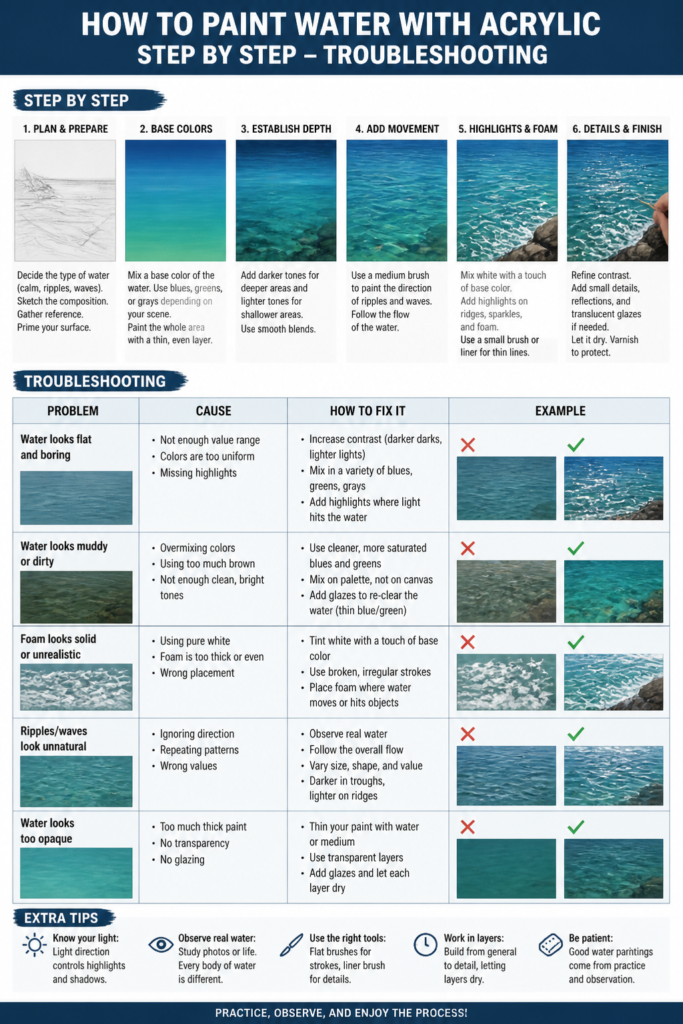
Water Looks Flat and Unrealistic
If your water lacks depth, it’s likely missing distinct values. Solution: Go back and build more contrast. Identify your darkest shadows and brightest highlights. Add more mid-tones by layering different shades of blue and green. Use glazing to add subtle shifts in color and transparency, creating the illusion of depth. Varying your brushstrokes will also help suggest movement and form.
Colors Appear Muddy
Muddy colors usually result from overmixing or using too many colors at once. Solution: Simplify your palette. Stick to a core set of blues, greens, and a neutral like Payne’s Gray. Avoid blending colors excessively on the canvas; instead, mix them on your palette. Apply colors in distinct layers, allowing each to dry, rather than trying to blend wet into wet for extended periods.
Ripples Don’t Look Natural
Unnatural ripples often stem from uniform size, shape, or placement. Solution: Study your reference photo closely. Ripples are irregular; they vary in size, intensity, and direction. Use short, horizontal, or slightly curved strokes, but vary their length and thickness. Remember that ripples become smaller and less defined as they recede into the distance. Break up your lines and introduce subtle variations.
Key Takeaways
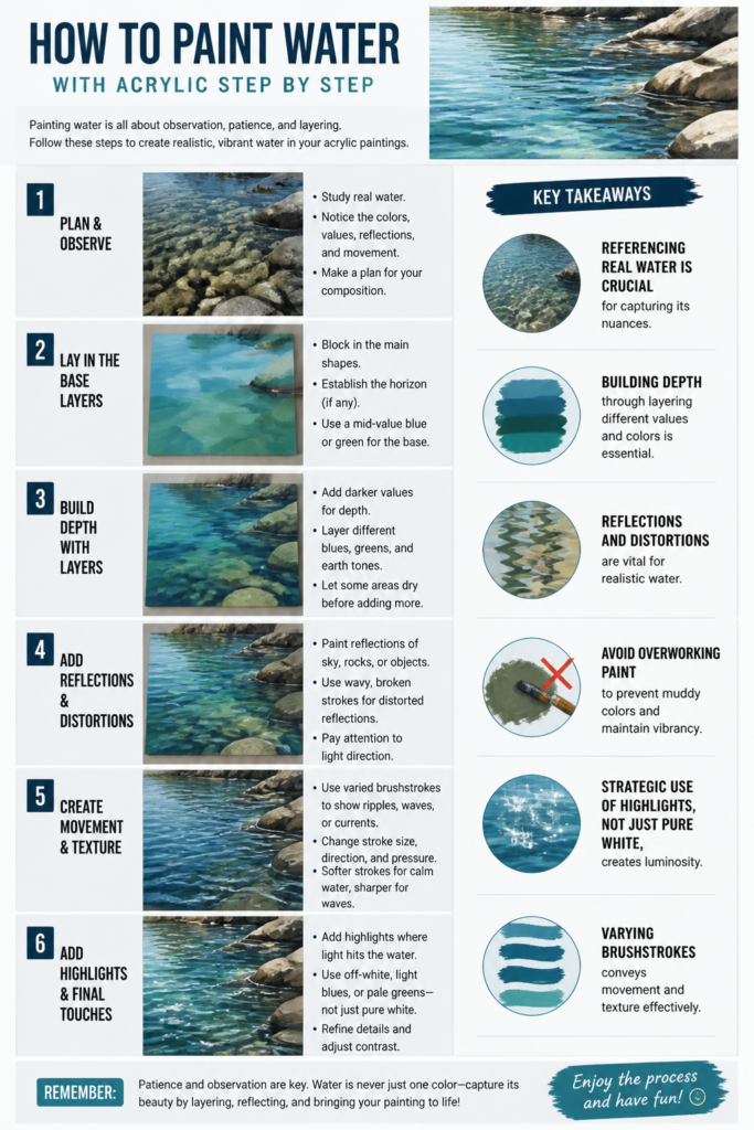
- Referencing real water is crucial for capturing its nuances.
- Building depth through layering different values and colors is essential.
- Reflections and distortions are vital for realistic water.
- Avoid overworking paint to prevent muddy colors and maintain vibrancy.
- Strategic use of highlights, not just pure white, creates luminosity.
- Varying brushstrokes conveys movement and texture effectively.
Frequently Asked Questions
What colors are best for painting water?
A versatile palette for water includes Ultramarine Blue, Phthalo Blue, Cerulean Blue, Payne’s Gray, Hooker’s Green, Sap Green, Raw Sienna, and Titanium White. You can mix countless variations of water colors from these. Don’t forget that water also reflects the sky and surrounding environment, so incorporate those hues as well.
How do I make water look transparent?
Transparency is achieved through layering thin, diluted washes of color. Start with lighter, more transparent layers, and gradually build up darker, more opaque areas for depth. Use glazing mediums to thin your acrylics without losing color intensity. Allowing the canvas or underlying layers to show through creates the illusion of clarity.
Should I use a medium with acrylics for water?
Yes, using an acrylic medium can be very beneficial. A fluid medium or glazing medium can extend drying time slightly, make paints more transparent, and create smoother blends. A pour-painting medium can achieve very smooth, glassy surfaces if that’s your goal. Experiment to find what works best for your desired effect.
How do I paint foam or splashes?
For foam, use a stiff brush with a light touch, applying dabs of very light, almost white, paint. Build up layers of broken white and very light blue/green. For splashes, use quick, flicking motions with a small, round brush, or even a toothbrush, loaded with light paint to create fine spray. Remember that foam and splashes are temporary, so paint them with energy and spontaneity.
Our Top Recommended Finds
- Professional Artist Acrylic Paint Set: A good quality set offers vibrant pigments and smooth consistency, making blending and layering much easier.
- Variety Brush Set (Flats, Rounds, Liners): Having a range of brush shapes and sizes allows you to tackle large washes, define mid-tones, and add fine details like ripples and reflections.
- Stay-Wet Palette: This type of palette keeps your acrylics moist for longer, reducing paint waste and giving you more time to work with your mixtures.
Your Artistic Journey Continues
You now have a robust framework for painting water with acrylics. This guide provides the tools, but the magic truly happens with practice and observation. Don’t be afraid to experiment with different water conditions – calm lakes, rushing rivers, or crashing ocean waves. Each presents unique challenges and rewards.
Take these steps, find a captivating reference, and start painting today. The more you observe and paint, the more intuitive the process will become. Embrace the learning, celebrate your progress, and let your creativity flow.