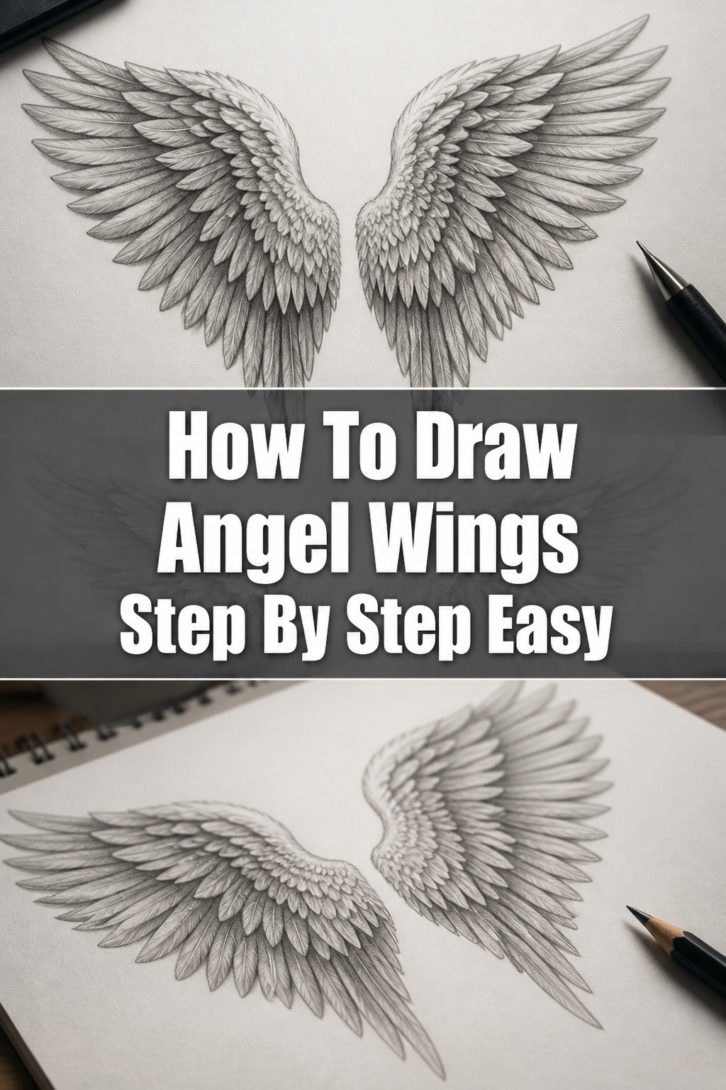
🕊️ How To Draw Angel Wings Step By Step Easy
& Painting
No rigid rules or pretension. Just practical guides, medium comparisons, and encouraging tips to help you enjoy the drawing & painting process.
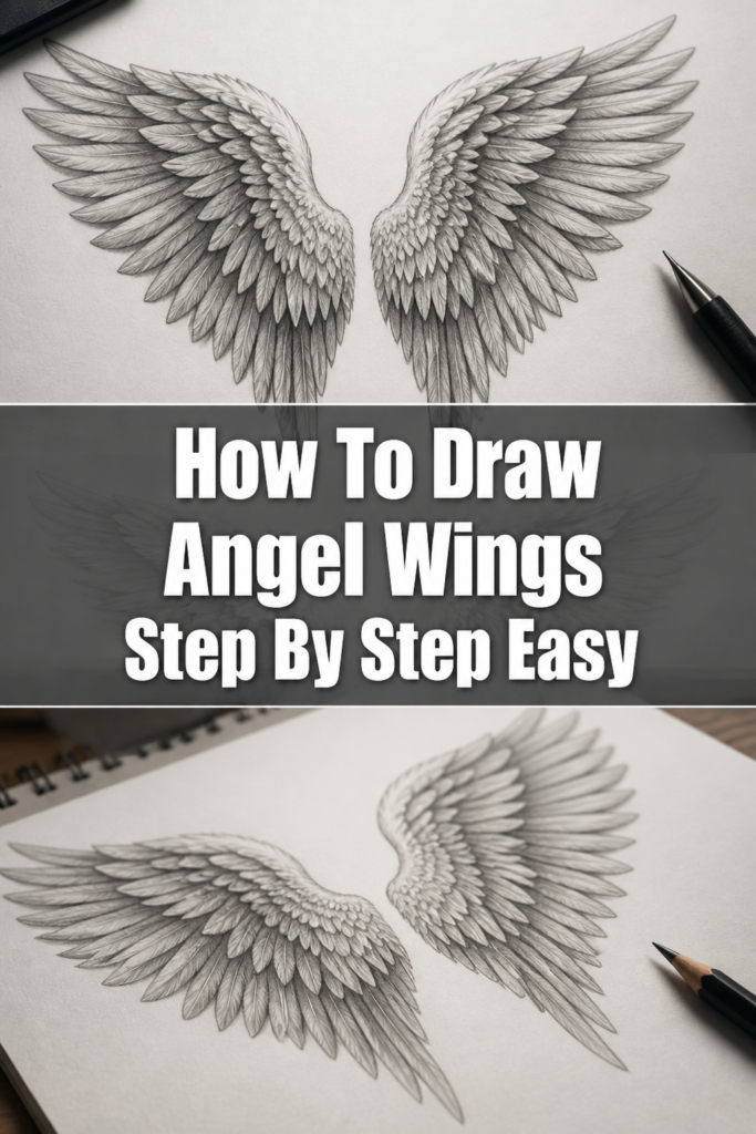
Learning to draw angel wings can seem like a daunting task at first glance.
There are so many feathers, so much detail, and the challenge of making them look both ethereal and realistic.
I remember struggling with my first pair, feeling overwhelmed by the sheer volume of individual feathers, but with a few simple techniques, you’ll be drawing beautiful wings in no time.
Quick Overview
This guide will walk you through the process of drawing stunning angel wings, breaking down complex forms into easy-to-follow steps.
You’ll learn how to build the structure, layer feathers, and add depth to your artwork.
- Time needed: 45-90 minutes (depending on desired detail)
- Difficulty: Beginner
- What you’ll need: Pencil (HB, 2B, 4B recommended), eraser (kneaded and vinyl), paper, blending stump (optional)
Step-by-Step Instructions
Step 1: Establish the Basic Structure and Placement
Begin by lightly sketching the placement of the wings on your character’s back.
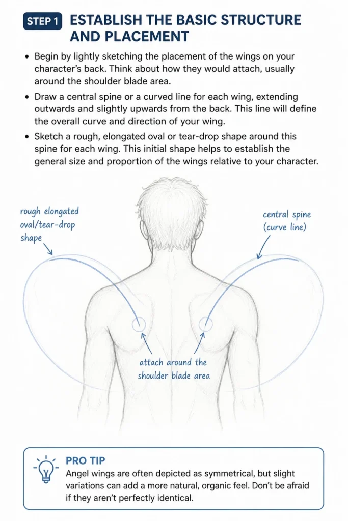
Think about how they would attach, usually around the shoulder blade area.
Draw a central “spine” or a curved line for each wing, extending outwards and slightly upwards from the back.
This line will define the overall curve and direction of your wing.
Sketch a rough, elongated oval or tear-drop shape around this spine for each wing.
This initial shape helps to establish the general size and proportion of the wings relative to your character.
Pro Tip: Angel wings are often depicted as symmetrical, but slight variations can add a more natural, organic feel. Don’t be afraid if they aren’t perfectly identical.
Step 2: Outline the Primary Feather Groups
Angel wings typically consist of three main layers of feathers: primary, secondary, and coverts.
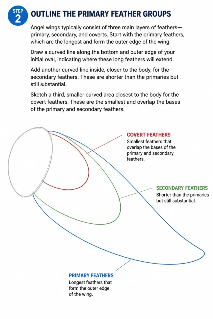
Start with the primary feathers, which are the longest and form the outer edge of the wing.
Draw a curved line along the bottom and outer edge of your initial oval, indicating where these long feathers will extend.
Add another curved line inside, closer to the body, for the secondary feathers.
These are shorter than the primaries but still substantial.
Sketch a third, smaller curved area closest to the body for the covert feathers.
These are the smallest and overlap the bases of the primary and secondary feathers.
Step 3: Define the Primary Feathers
Now, let’s bring those long primary feathers to life.
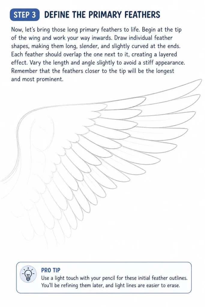
Begin at the tip of the wing and work your way inwards.
Draw individual feather shapes, making them long, slender, and slightly curved at the ends.
Each feather should overlap the one next to it, creating a layered effect.
Vary the length and angle slightly to avoid a stiff appearance.
Remember that the feathers closer to the tip will be the longest and most prominent.
Pro Tip: Use a light touch with your pencil for these initial feather outlines. You’ll be refining them later, and light lines are easier to erase.
Step 4: Layer the Secondary Feathers
Move on to the secondary feather group, situated above the primaries.
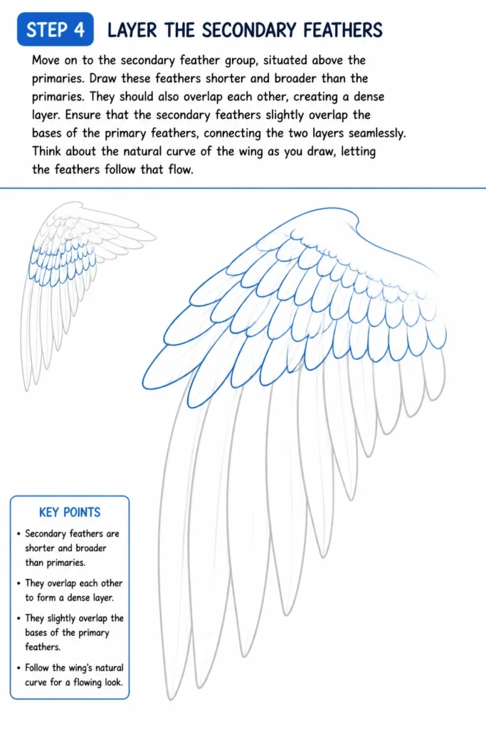
Draw these feathers shorter and broader than the primaries.
They should also overlap each other, creating a dense layer.
Ensure that the secondary feathers slightly overlap the bases of the primary feathers, connecting the two layers seamlessly.
Think about the natural curve of the wing as you draw, letting the feathers follow that flow.
Step 5: Add the Covert Feathers
The covert feathers are the smallest and softest, covering the “shoulder” of the wing.
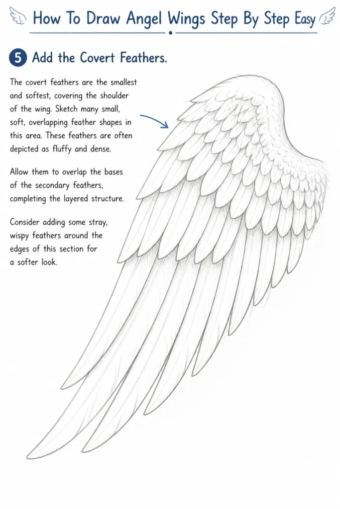
Sketch many small, soft, overlapping feather shapes in this area.
These feathers are often depicted as fluffy and dense.
Allow them to overlap the bases of the secondary feathers, completing the layered structure.
Consider adding some stray, wispy feathers around the edges of this section for a softer look.
Step 6: Refine Outlines and Add Texture
Once all the feather groups are in place, it’s time to clean up your lines.
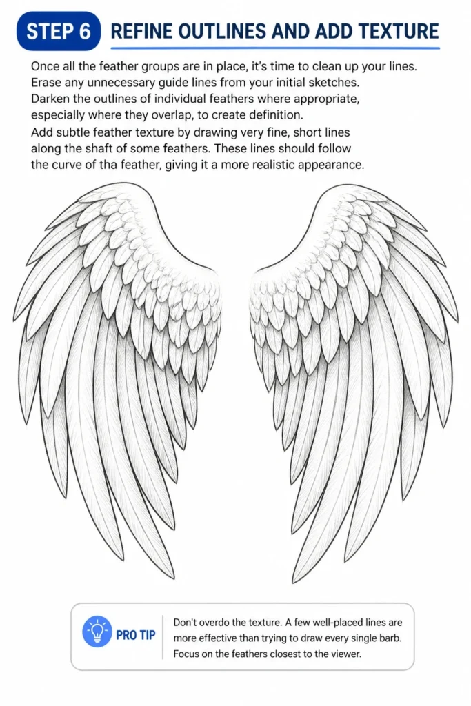
Erase any unnecessary guide lines from your initial sketches.
Darken the outlines of individual feathers where appropriate, especially where they overlap, to create definition.
Add subtle feather texture by drawing very fine, short lines along the shaft of some feathers.
These lines should follow the curve of the feather, giving it a more realistic appearance.
Pro Tip: Don’t overdo the texture. A few well-placed lines are more effective than trying to draw every single barb. Focus on the feathers closest to the viewer.
Step 7: Introduce Shading and Depth
Shading is crucial for making your wings look three-dimensional and majestic.
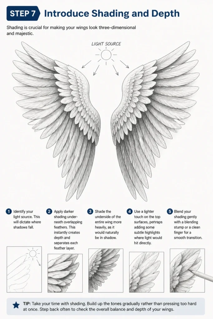
Identify your light source. This will dictate where shadows fall.
Apply darker shading underneath overlapping feathers.
This instantly creates depth and separates each feather layer.
Shade the underside of the entire wing more heavily, as it would naturally be in shadow.
Use a lighter touch on the top surfaces, perhaps adding some subtle highlights where light would hit directly.
Blend your shading gently with a blending stump or a clean finger for a smooth transition.
Step 8: Connect to the Body and Final Touches
Ensure the wings look like they are naturally attached to the character’s back.
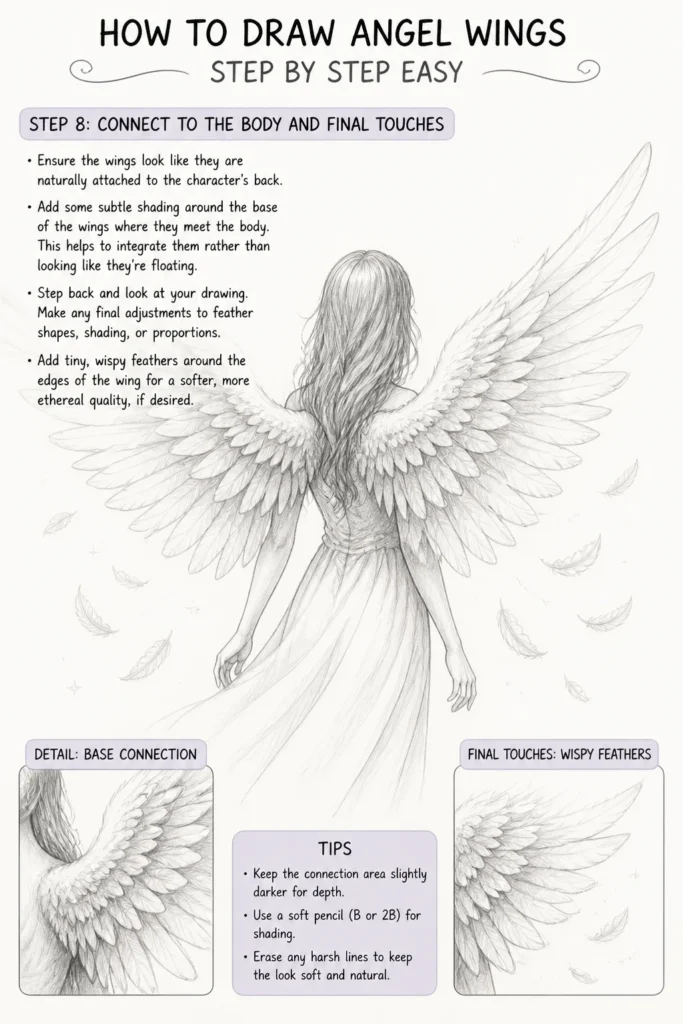
Add some subtle shading around the base of the wings where they meet the body.
This helps to integrate them rather than looking like they’re floating.
Step back and look at your drawing.
Make any final adjustments to feather shapes, shading, or proportions.
Add tiny, wispy feathers around the edges of the wing for a softer, more ethereal quality, if desired.
Common Mistakes to Avoid
Flatness and Lack of Dimension
Many beginners draw wings as flat, two-dimensional shapes pasted onto a character. The key to avoiding this is understanding overlap and shading.
Always ensure feathers clearly overlap one another, and use shading to create depth, particularly underneath each overlapping feather and on the wing’s underside.
Incorrect Feather Direction
Feathers don’t just point straight down. Primary feathers fan out from the “hand” part of the wing, while secondary and covert feathers follow the curve of the arm and shoulder. Pay attention to how real bird wings (even if stylized) direct their feathers.
Drawing feathers all pointing in the same direction makes the wing look stiff and unnatural, rather than dynamic and capable of flight.
Symmetry Over Naturalism
While angel wings are often symmetrical, striving for perfect mirror images can make them look artificial. Slight variations in feather placement, length, or curve between the left and right wing can add realism.
Embrace minor imperfections; they contribute to the organic feel of a living, breathing creature, even a fantastical one.
Over-detailing Every Feather
It’s tempting to draw every single feather barb. This can lead to a cluttered, busy drawing that loses its overall impact. Focus on detailing the feathers closest to the viewer or at key points of emphasis.
For feathers further back or in shadow, imply detail with shading and broad shapes rather than drawing individual lines, allowing the eye to fill in the rest.
Troubleshooting
My Wings Look Stiff and Lifeless
If your wings lack movement, chances are your initial structural lines were too straight or rigid. Go back to Step 1 and try sketching a more dynamic, flowing curve for the wing’s spine.
Also, ensure your individual feathers have a slight curve to them and vary in angle. Avoid drawing them all as perfectly straight lines, which contributes to a stiff appearance.
The Feathers Look Too Uniform
Uniformity makes wings appear artificial. To fix this, introduce more variety in your feather shapes and sizes, especially within the primary and secondary groups.
Some feathers can be slightly wider, others narrower; some can have a more pronounced curve. Don’t be afraid to make a few appear slightly ruffled or out of place for a natural look.
I’m Struggling with Perspective
Drawing wings in perspective can be tricky. Start by understanding that feathers closer to the viewer will appear larger and more detailed, while those receding will look smaller and less defined.
Practice drawing the basic wing shape from different angles before adding feathers. Simplify the feather shapes when drawing from a sharp angle, focusing on the overall form rather than individual detail.
Key Takeaways
- Start with a strong foundation: A clear structural line and basic shape are essential before adding any feathers.
- Layering is key: Build your wings with primary, secondary, and covert feathers, ensuring they overlap naturally.
- Vary feather shapes and sizes: Avoid uniformity to create a more dynamic and realistic look.
- Embrace shading for depth: Use shadows under overlapping feathers and on the wing’s underside to create a three-dimensional effect.
- Don’t over-detail: Focus on key areas and imply detail elsewhere to maintain clarity and impact.
- Practice makes perfect: The more you draw, the better you’ll understand the nuances of feather placement and form.
Frequently Asked Questions
How do I make the wings look fluffy?
To achieve a fluffy look, particularly for the covert feathers, use softer, less defined lines. Instead of sharp outlines, sketch short, wispy strokes that suggest many small, soft feathers. Blend lightly with a blending stump or cotton swab to create a soft, cloud-like texture.
Should angel wings always be white?
Not at all! While white is traditional, angel wings can be any color you imagine. Consider shades of gold, iridescent blues, or even dark, dramatic tones for different artistic effects. The principles of structure and shading remain the same regardless of color.
How do I draw folded angel wings?
Drawing folded wings requires understanding how the feathers would tuck in. The primary feathers would fold inward, becoming the outermost edge of the folded wing. The secondary and covert feathers would layer over them. Focus on the overall compact shape first, then imply the tucked-in feathers with overlapping curves and careful shading.
What if my wings don’t look symmetrical?
Don’t worry too much about perfect symmetry. In fact, slight asymmetry can make your drawing look more natural and less robotic. Focus on the overall balance and flow of the wings. If one wing is significantly larger or shaped very differently, you might adjust it, but minor differences are often desirable.
Our Top Recommended Finds
- Sketchbook with quality paper: A good surface prevents smudging and allows for multiple layers of graphite without tearing.
- Set of graphite pencils (HB, 2B, 4B, 6B): Having various hardness levels allows for light sketching, defining lines, and rich shading.
- Kneaded eraser: Excellent for lifting graphite gently without smudging and shaping into fine points for highlights.
Unleash Your Inner Artist
You’ve now got the tools and knowledge to create beautiful angel wings.
Remember, every artist starts somewhere, and practice is your best friend.
Try drawing wings on different characters, in various poses, and experiment with light sources.
Why not pick up your pencil right now and bring your next angelic creation to life?
& Painting
No rigid rules or pretension. Just practical guides, medium comparisons, and encouraging tips to help you enjoy the drawing & painting process.