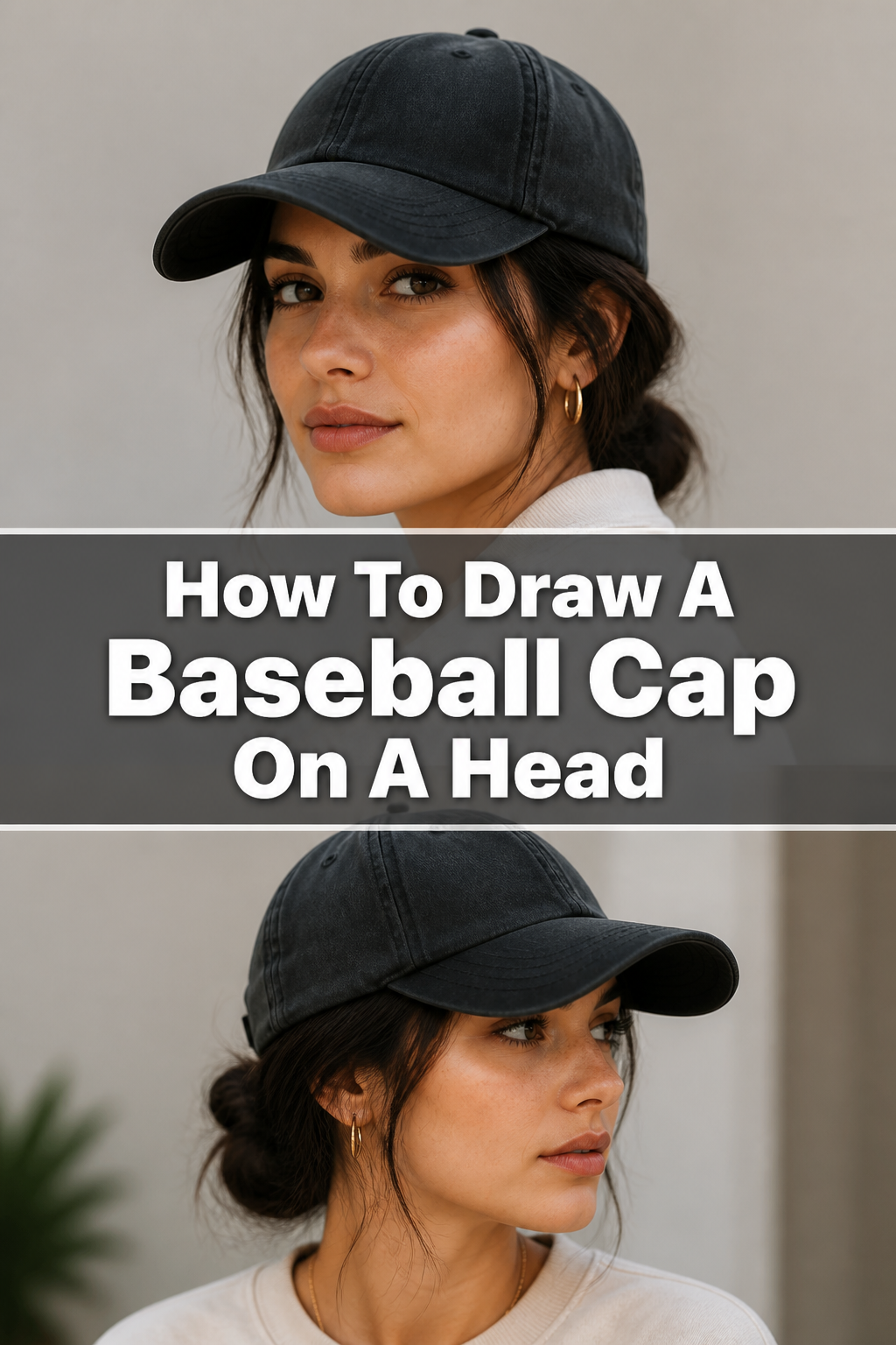
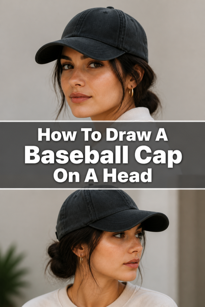
🧢 How To Draw A Baseball Cap On A Head
& Painting
No rigid rules or pretension. Just practical guides, medium comparisons, and encouraging tips to help you enjoy the drawing & painting process.
Learning to draw a baseball cap on a head can feel tricky at first. It’s all about understanding how fabric drapes and how the cap sits on a three-dimensional form. I remember struggling with brims that looked flat or crowns that seemed to float above the head.
Over time, I’ve learned that breaking it down into simple shapes makes all the difference. This guide will walk you through each stage, ensuring your baseball cap looks natural and dynamic. You’ll gain the confidence to draw this iconic headwear with ease.
Quick Overview
Ready to create a perfectly perched baseball cap? This guide will empower you to draw a cap that truly fits the head, complete with realistic form and details. You’ll learn the essential techniques to make your drawings look professional and convincing.
- Time needed: 45-75 minutes (depending on detail)
- Difficulty: Intermediate
- What you’ll need: Pencil (HB, 2B), eraser, paper, reference images (optional)
Step-by-Step Instructions
Step 1: Establish the Head and Guidelines
Begin by sketching the basic shape of the head. A simple circle for the cranium and a jawline extending downwards will suffice. Think of it as a loose egg shape.
Next, draw a vertical line down the center of the face and a horizontal line for the eye level. These guidelines help ensure symmetry and proper cap placement.
Consider the head’s angle. Is it looking straight ahead, tilted, or turned? Adjust your guidelines to match this perspective.
Pro Tip: Light, feathery lines are your best friend at this stage. You’ll be erasing a lot, so avoid pressing down too hard.
Step 2: Define the Cap’s Base (The Band)
Now, locate where the cap will sit on the head. A baseball cap typically rests just above the eyebrows, encircling the forehead.
Draw an elliptical line around the head, following its curvature. This line represents the bottom edge of the cap’s band. It should appear slightly curved, not flat, to convey the roundness of the head.
Imagine the cap’s band as a ribbon wrapping around the head. Ensure it looks snug, not loose or floating.
Step 3: Construct the Cap’s Crown (Dome)
From the band you just drew, extend lines upwards to form the dome of the cap. These lines will curve inwards towards the top.
The crown isn’t a perfect hemisphere; it has a slight forward slope. Observe how real caps subtly lean forward over the forehead.
At the very top, add a small, slightly flattened circle. This represents the button found on most baseball caps.
Step 4: Shape the Cap’s Brim (Bill)
The brim is a crucial element. Begin by drawing a curved line extending from the front of the cap’s band. This line forms the top edge of the brim.
Next, draw another curved line underneath the first, following its trajectory. This creates the thickness of the brim.
Ensure the brim appears rigid and extends outwards, often slightly angled downwards. Its curve should match the overall perspective of the head.
Think about the brim’s curve. Is it flat, slightly curved, or heavily curved like a traditional baseball player’s cap?
Step 5: Add Seams and Structural Details
Most baseball caps have visible seams that divide the crown into panels. Draw subtle lines extending from the button at the top down to the band. There are typically six panels.
Indicate the small eyelets (ventilation holes) on some of these panels. These are usually tiny circles or dots.
If the cap has a logo or emblem, sketch its general shape on the front panel. Don’t worry about intricate details yet, just the placement.
Step 6: Refine Form and Add Folds
This is where your cap starts to look realistic. Erase any overlapping head guidelines that are now hidden by the cap.
Introduce subtle folds and wrinkles, especially where the cap might slightly crease or where the fabric meets the brim. These aren’t sharp lines but soft indications.
Consider how the cap would naturally sag or have slight indentations. The fabric isn’t perfectly smooth.
Step 7: Shading and Final Touches
To give your cap depth, apply shading. Determine your light source and shade the areas that would be in shadow.
The underside of the brim will almost always be darker. Areas where the cap curves away from the light source will also be darker.
Add a cast shadow from the brim onto the face, if applicable. This greatly enhances realism.
Finally, darken your main lines and add any specific details like stitching on the brim or a detailed logo. A light touch with a kneaded eraser can soften any harsh lines.
Common Mistakes to Avoid
Floating Cap Syndrome
This happens when the cap appears to hover above the head instead of sitting snugly on it. The common cause is drawing the cap’s band too high or failing to integrate it with the head’s curvature. Always ensure the cap’s base follows the natural curve of the skull, making it look like it’s actually worn. Imagine the pressure points where the cap would rest.
Flat Brim Blunder
A flat, straight line for the brim instantly flattens the entire drawing. The brim of a cap, even a relatively flat one, always has some perspective and curvature when viewed on a three-dimensional head. Always draw the brim with appropriate curves that match the head’s angle and the cap’s own structure. Use elliptical curves, not straight lines.
Symmetry Overload
While some symmetry is good, making every seam and curve perfectly identical can make the cap look stiff and unnatural. Real caps, especially when worn, have subtle imperfections, slight tilts, and natural folds. Allow for slight variations and organic curves to give your cap a more authentic and lived-in feel. Embrace a little asymmetry for realism.
Ignoring Head Anatomy
Drawing a cap without first establishing the head’s basic shape and guidelines can lead to proportion issues. The cap needs a head to sit on, and if the head is misshapen or poorly placed, the cap will inherit those problems. Always start with a solid head foundation, even if it’s just a light sketch, to ensure the cap fits correctly.
Troubleshooting
Cap Looks Too Small/Large
If your cap’s proportions seem off, it’s likely due to the initial sizing relative to the head. Go back to Step 2 and re-evaluate the cap’s band. It should comfortably encircle the upper part of the head, not squeeze it or appear too loose. Use your initial head sketch as a guide for scale.
Try drawing the cap as if you’re putting it on the head yourself. Does it feel right? Adjust the overall scale of the cap’s crown and brim to match the head’s size.
Brim Doesn’t Look Right
A common issue is the brim appearing too flat, too pointy, or disconnected. Revisit Step 4. Ensure the brim’s curve matches the head’s perspective. If the head is turned, the brim should reflect that turn.
Consider the thickness of the brim; it’s not a single line. Draw both the top and bottom edges, giving it dimension. Practice drawing different brim curves to get a feel for their varied shapes.
Lack of Depth and Realism
If your cap looks flat, you might be missing key elements like shading and folds. Return to Step 6 and Step 7. Add subtle wrinkles where the fabric would naturally crease.
Most importantly, introduce shading to define the cap’s form and create shadows. The underside of the brim is a prime area for darker shading, instantly adding depth. A clear light source is crucial for effective shading.
Key Takeaways
- Always start with a light sketch of the head to ensure proper cap placement and proportion.
- The cap’s band should follow the curvature of the head, making it appear snug and worn.
- Pay close attention to the brim’s perspective and curve; it’s rarely a flat, straight line.
- Add subtle details like seams, eyelets, and folds to give the cap a realistic texture.
- Shading is essential for creating depth, form, and making the cap look three-dimensional.
- Practice observing real baseball caps from different angles to understand their structure and how they sit.
Frequently Asked Questions
What pencil hardness is best for drawing caps?
Start with an HB pencil for your initial sketches and guidelines, as it’s light and easy to erase. For darker lines and shading, move to a 2B or even 4B pencil. A softer lead allows for richer blacks and smoother transitions.
How do I make the cap look like it’s made of fabric?
To convey fabric, avoid perfectly straight or rigid lines. Introduce subtle, soft folds and wrinkles, especially around the crown and where the cap meets the head. Use varied line weight – lighter lines for subtle creases, darker for defining edges. Shading also plays a huge role in depicting texture.
Should I draw the head first, or the cap?
Always start with a basic sketch of the head. Even if it’s just a simple oval, it provides the essential foundation for placing the cap correctly. Drawing the cap first often leads to proportion issues and a cap that doesn’t quite “fit” the invisible head underneath.
How do I draw different types of baseball caps (e.g., flat brim vs. curved brim)?
The core steps remain the same, but the brim is where you’ll make your primary adjustments. For a flat brim, ensure the top and bottom lines of the brim are straighter, with minimal downward curve. For a heavily curved brim, exaggerate the arc of both the top and bottom brim lines. Observe reference photos of the specific cap style you want to draw.
Our Top Recommended Finds
- Sketching Pencils Set: A good range of graphite pencils (HB, 2B, 4B, 6B) gives you versatility for sketching, line work, and shading.
- Kneaded Eraser: Essential for lifting graphite without smudging and for softening lines, giving your drawings a professional finish.
- Sketchbook with Quality Paper: Acid-free paper with a smooth but slightly textured surface helps pencils glide and holds graphite well, making your drawing experience more enjoyable.
Your Next Masterpiece Awaits
You’ve now got a solid foundation for drawing a baseball cap on a head. It’s a skill that adds so much character and realism to your figures. Don’t stop here; the real learning happens when you put pencil to paper.
Challenge yourself to draw caps from various angles, on different head shapes, and with unique styles. Perhaps try adding a subtle logo or experimenting with different lighting conditions. The more you practice, the more natural and effortless it will become. Grab your tools and start sketching your next cap-wearing character today!
& Painting
No rigid rules or pretension. Just practical guides, medium comparisons, and encouraging tips to help you enjoy the drawing & painting process.