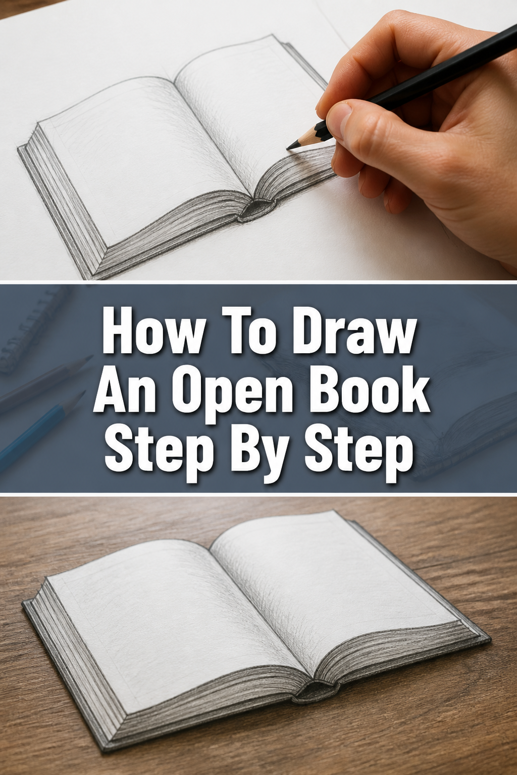
📖 How To Draw An Open Book Step By Step
& Painting
No rigid rules or pretension. Just practical guides, medium comparisons, and encouraging tips to help you enjoy the drawing & painting process.
I remember the thrill of bringing simple shapes to life on paper, transforming a few lines into something recognizable and inviting. Learning to draw an open book was one of those early, satisfying milestones in my own artistic journey. This guide will walk you through the process, sharing the insights I’ve gathered over years of sketching.
You don’t need to be an expert to follow along. With patience and these straightforward steps, you’ll soon have your own beautifully drawn open book. Let’s make this creative experience enjoyable and rewarding together.
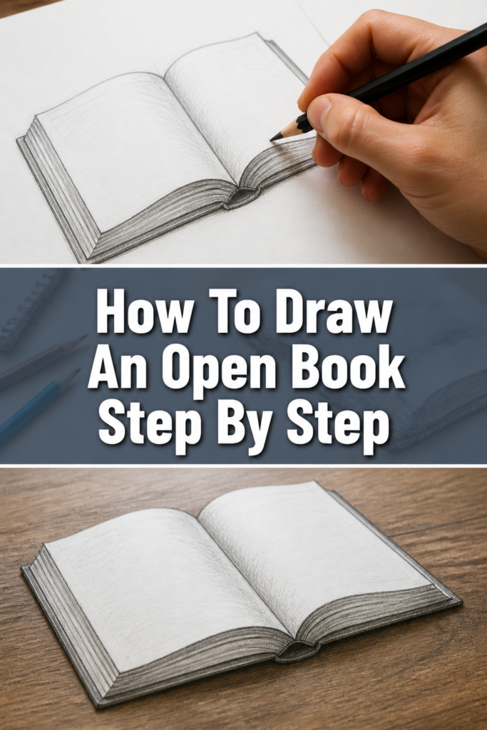
Quick Overview
By the end of this guide, you will have created a detailed and realistic drawing of an open book, complete with perspective and depth. You’ll understand the underlying structure and essential techniques for drawing curved pages and covers.
This journey will empower you to apply these skills to other objects and scenes.
- Time needed: 30-60 minutes
- Difficulty: Beginner to Intermediate
- What you’ll need: Pencil (HB, 2B recommended), Eraser (kneaded or stick), Paper, Ruler (optional)
Step-by-Step Instructions
Step 1: Sketch the Foundation – The Spine and Base
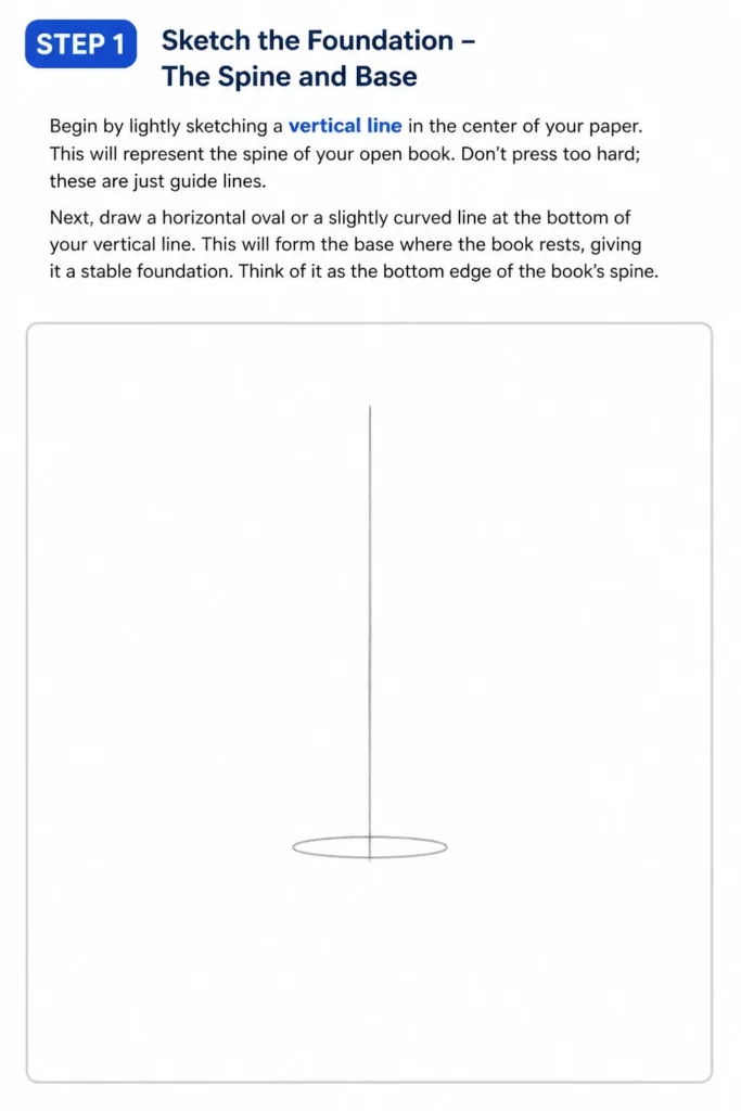
Begin by lightly sketching a vertical line in the center of your paper. This will represent the spine of your open book. Don’t press too hard; these are just guide lines.
Next, draw a horizontal oval or a slightly curved line at the bottom of your vertical line. This will form the base where the book rests, giving it a stable foundation. Think of it as the bottom edge of the book’s spine.
Step 2: Establish the Book’s Form – The Open Covers
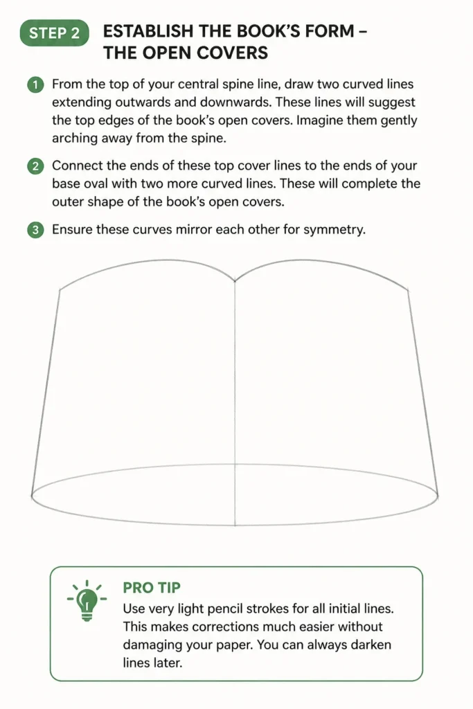
From the top of your central spine line, draw two curved lines extending outwards and downwards. These lines will suggest the top edges of the book’s open covers. Imagine them gently arching away from the spine.
Connect the ends of these top cover lines to the ends of your base oval with two more curved lines. These will complete the outer shape of the book’s open covers. Ensure these curves mirror each other for symmetry.
Pro Tip: Use very light pencil strokes for all initial lines. This makes corrections much easier without damaging your paper. You can always darken lines later.
Step 3: Define the Inner Curve of the Pages
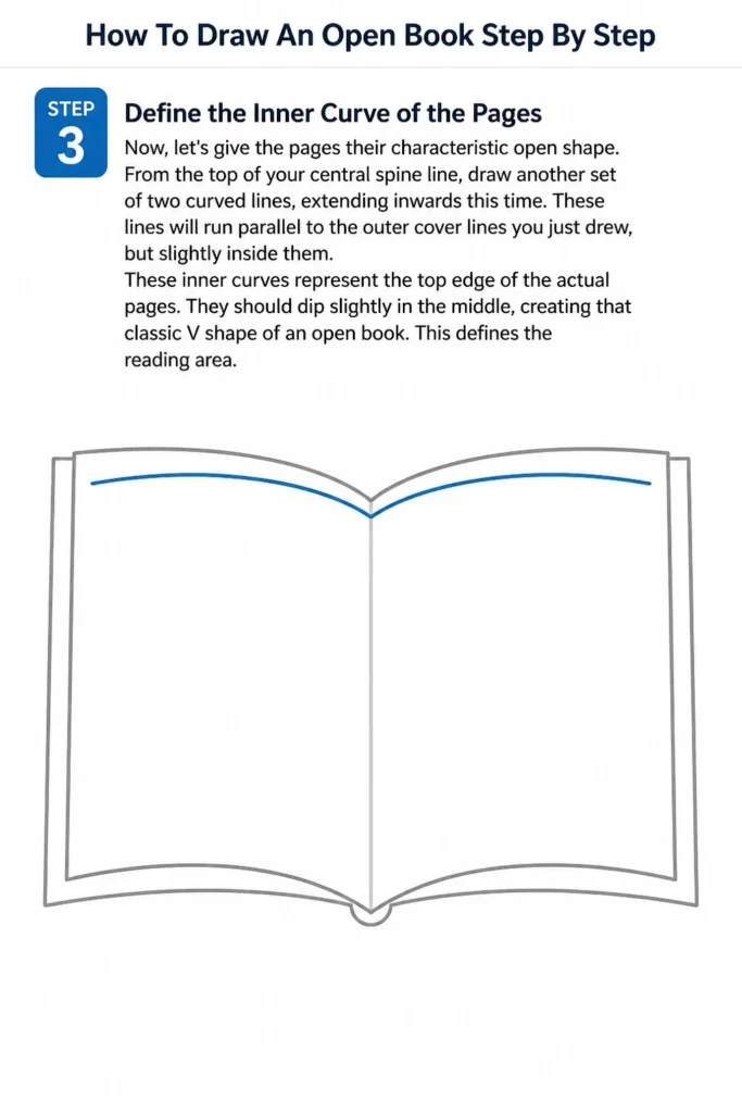
Now, let’s give the pages their characteristic open shape. From the top of your central spine line, draw another set of two curved lines, extending inwards this time. These lines will run parallel to the outer cover lines you just drew, but slightly inside them.
These inner curves represent the top edge of the actual pages. They should dip slightly in the middle, creating that classic “V” shape of an open book. This defines the reading area.
Step 4: Add Thickness to the Pages
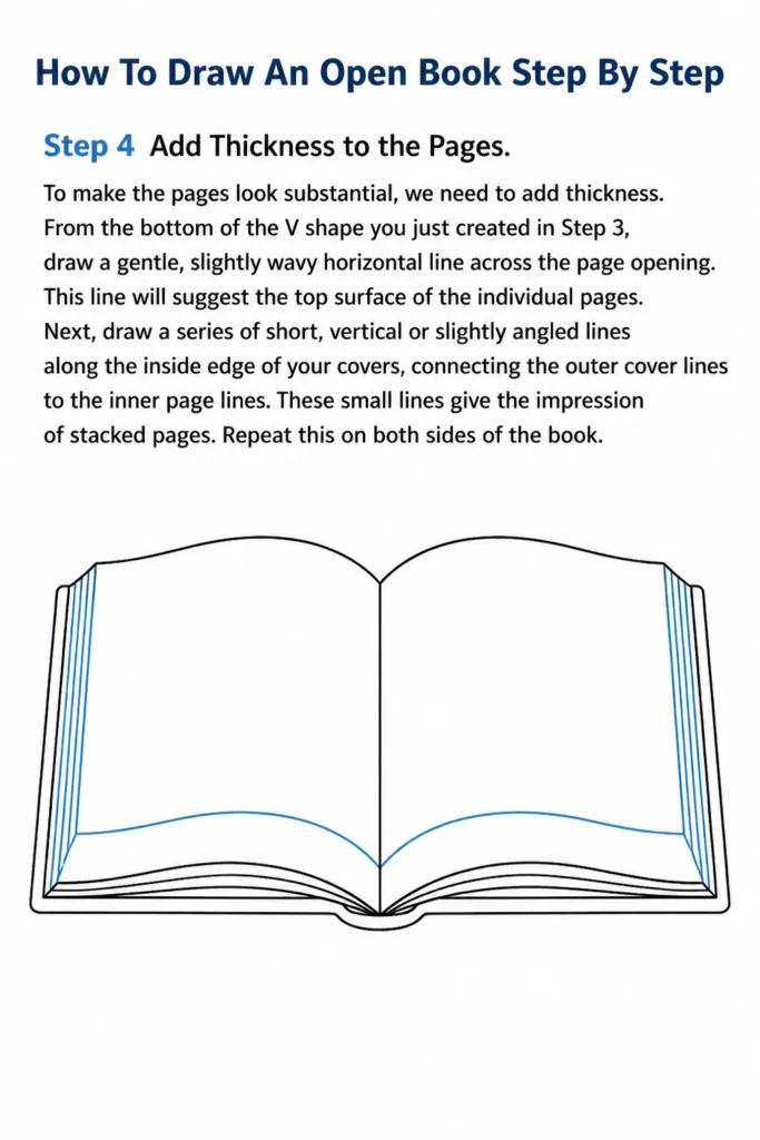
To make the pages look substantial, we need to add thickness. From the bottom of the “V” shape you just created in Step 3, draw a gentle, slightly wavy horizontal line across the page opening. This line will suggest the top surface of the individual pages.
Next, draw a series of short, vertical or slightly angled lines along the inside edge of your covers, connecting the outer cover lines to the inner page lines. These small lines give the impression of stacked pages. Repeat this on both sides of the book.
Step 5: Create the Illusion of Individual Pages
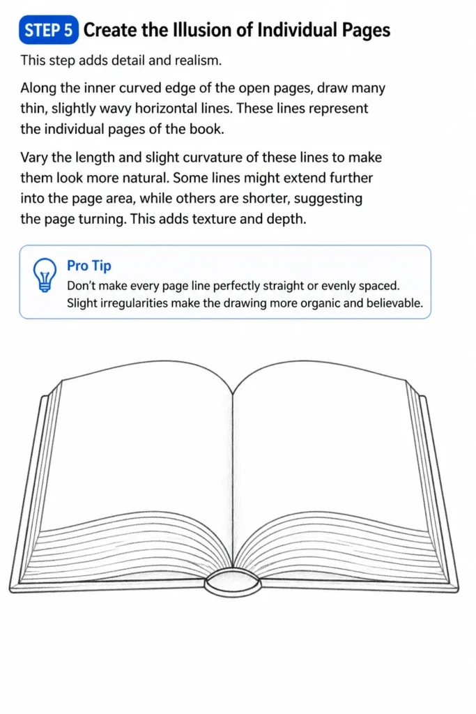
This step adds detail and realism. Along the inner curved edge of the open pages, draw many thin, slightly wavy horizontal lines. These lines represent the individual pages of the book.
Vary the length and slight curvature of these lines to make them look more natural. Some lines might extend further into the page area, while others are shorter, suggesting the page turning. This adds texture and depth.
Pro Tip: Don’t make every page line perfectly straight or evenly spaced. Slight irregularities make the drawing more organic and believable.
Step 6: Develop the Book’s Cover Details
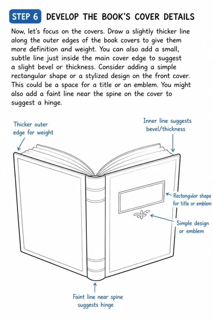
Now, let’s focus on the covers. Draw a slightly thicker line along the outer edges of the book covers to give them more definition and weight. You can also add a small, subtle line just inside the main cover edge to suggest a slight bevel or thickness.
Consider adding a simple rectangular shape or a stylized design on the front cover. This could be a space for a title or an emblem. You might also add a faint line near the spine on the cover to suggest a hinge.
Step 7: Introduce Shading and Depth
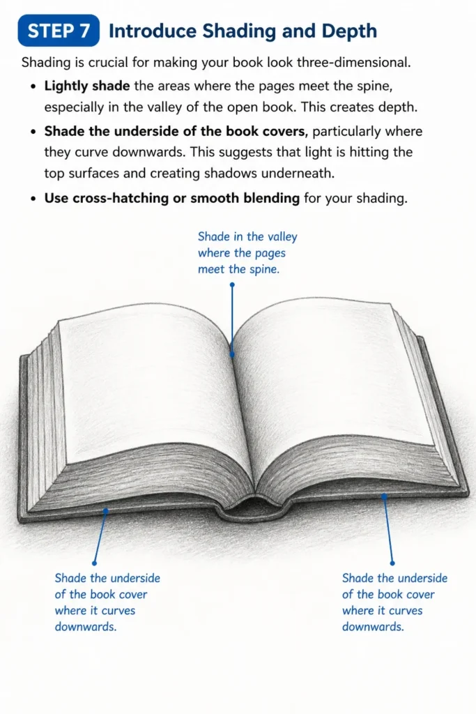
Shading is crucial for making your book look three-dimensional. Lightly shade the areas where the pages meet the spine, especially in the “valley” of the open book. This creates depth.
Shade the underside of the book covers, particularly where they curve downwards. This suggests that light is hitting the top surfaces and creating shadows underneath. Use cross-hatching or smooth blending for your shading.
Step 8: Refine and Enhance
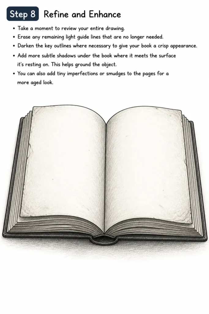
Take a moment to review your entire drawing. Erase any remaining light guide lines that are no longer needed. Darken the key outlines where necessary to give your book a crisp appearance.
Add more subtle shadows under the book where it meets the surface it’s resting on. This helps ground the object. You can also add tiny imperfections or smudges to the pages for a more aged look.
Common Mistakes to Avoid
Drawing Flat Pages
Many beginners draw the open pages as two flat, straight rectangles. This makes the book appear stiff and unnatural, losing the characteristic curve of an open book. Remember that pages naturally bend and dip in the middle when open. Always ensure your page lines have a gentle, consistent curve, mimicking a soft “V” shape rather than a sharp angle.
Ignoring Perspective
Failing to consider perspective can make your book look skewed or unrealistic. If you’re drawing the book from a slight angle, the sides closer to you should appear slightly larger, and lines should converge towards a vanishing point. Even a simple book needs some sense of perspective to feel grounded and three-dimensional on the page. Pay attention to how the covers and pages recede.
Lack of Thickness
A common oversight is drawing pages and covers as if they have no thickness. A book is a three-dimensional object with measurable depth. Without adding thickness, especially to the edges of the covers and the stack of pages, your drawing will look like a flat cutout. Always remember to add those small, defining lines that show the material’s depth.
Overly Symmetrical Curves
While symmetry is good, making every curve perfectly identical can sometimes make the drawing feel rigid. Books are organic objects, and pages might bend slightly differently. Allow for subtle variations in your curves, especially in the individual page lines, to give your drawing a more natural and hand-drawn feel. Perfect symmetry can sometimes detract from realism.
Troubleshooting
My Book Looks Flat
If your book appears two-dimensional, it’s likely missing crucial depth cues. Revisit your shading in the “valley” of the open pages and under the covers. Ensure you’ve added thickness to the pages and covers, drawing those small lines that indicate depth. Additionally, check your perspective; even subtle foreshortening can add volume.
The Pages Seem Uneven or Jagged
Uneven pages often result from inconsistent curves or varying line pressure. Practice drawing smooth, continuous curves with a light hand. If lines are too jagged, try using a lighter pencil or loosening your grip. Remember that individual page lines don’t need to be perfectly uniform; slight variations are good, but major inconsistencies can disrupt the flow.
I’m Struggling with the Curves
Drawing smooth, consistent curves can be challenging. Try practicing curve exercises on a separate sheet of paper. Don’t try to draw the entire curve in one go; use several light, overlapping strokes to build up the shape. You can also lightly sketch a series of dots to guide your curve before connecting them. Rotate your paper if it helps your arm move more freely.
Key Takeaways
- Always start with light guide lines to establish the basic structure of your book.
- Emphasize the natural curve of open pages to avoid a flat appearance.
- Add thickness to both the covers and the stack of pages for a three-dimensional effect.
- Use shading to create depth, particularly in the page ‘valley’ and under the covers.
- Don’t strive for perfect symmetry; slight variations can enhance realism.
- Practice drawing curves separately to improve your hand control and consistency.
Frequently Asked Questions
What pencil hardness is best for drawing an open book?
An HB pencil is excellent for initial sketches and general outlines, offering a good balance between darkness and erasability. For shading and darker details, a 2B or 4B pencil will give you richer tones and deeper shadows, adding more contrast and realism to your drawing.
How do I make the pages look like paper, not just solid blocks?
To make pages look like paper, focus on adding subtle texture and individual page lines. Vary the length and slight waviness of these lines. You can also add very light, almost invisible, horizontal lines across the page surface to suggest the paper grain. A faint, soft shadow where pages overlap can also help.
Should I use a ruler for this drawing?
While a ruler can be helpful for establishing the initial straight spine or the overall rectangular footprint of the book, try to freehand the curves for the pages and covers. Over-reliance on a ruler for organic shapes can make the drawing appear stiff. Use it for initial setup, then switch to freehand for natural movement.
How can I make my book look old or worn?
To give your book an aged look, add subtle imperfections. You can include slightly frayed edges on the covers, tiny tears or dog-ears on some page corners, or faint creases along the spine. Use varied shading to suggest discoloration or wear patterns on the cover and page edges.
Our Top Recommended Finds
- Sketchbook with Quality Paper: A good sketchbook with paper that can handle erasing and layering is essential for any drawing project. It prevents bleed-through and allows for smoother blending.
- Graphite Pencil Set: Having a range of pencils (e.g., HB, 2B, 4B, 6B) allows you to achieve different line weights and shading intensities, adding depth and professionalism to your drawings.
- Kneaded Eraser: Unlike traditional erasers, a kneaded eraser can lift graphite without smudging or damaging the paper. It’s excellent for subtle lightening and cleaning up guide lines.
Your Next Chapter in Drawing Begins Now
You’ve just taken a fantastic step in your artistic journey, creating a detailed open book. This skill is more than just drawing an object; it’s about understanding form, perspective, and the interplay of light and shadow. You’ve built a foundation for many other drawing challenges.
Why not challenge yourself further? Try drawing your open book from a different angle, perhaps with a bookmark peeking out, or add a pair of reading glasses resting on its pages. Explore adding text or illustrations to the open pages. The possibilities are endless. Keep practicing, keep observing, and most importantly, keep enjoying the process of bringing your imagination to life on paper.
& Painting
No rigid rules or pretension. Just practical guides, medium comparisons, and encouraging tips to help you enjoy the drawing & painting process.