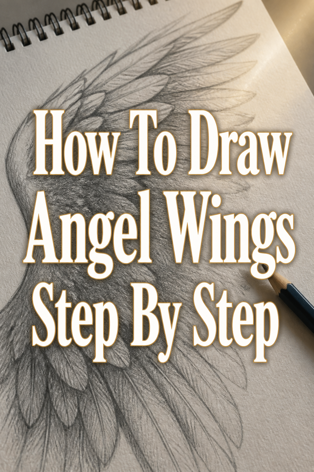
🕊️ How To Draw Angel Wings Step By Step
& Painting
No rigid rules or pretension. Just practical guides, medium comparisons, and encouraging tips to help you enjoy the drawing & painting process.
Drawing beautiful angel wings can feel like a complex task. I remember my own frustration trying to capture their ethereal grace and intricate feather details. This guide will simplify the process.
You will learn practical techniques to create stunning, believable wings. We will build your confidence in sketching these majestic features from the ground up.
Quick Overview
This guide will walk you through the entire process of drawing angel wings, from initial skeletal structure to refined feather details and shading. You’ll gain a solid understanding of wing anatomy and how to apply it to your artwork.
- Time needed: 1.5 – 2.5 hours (allowing for practice)
- Difficulty: Intermediate (some detail work required)
- What you’ll need: Pencils (HB, 2B, 4B recommended), quality drawing paper, eraser (kneaded is ideal), blending stump (optional).
Step-by-Step Instructions
Step 1: Understand Wing Anatomy
Begin by familiarizing yourself with the basic skeletal structure of a bird’s wing. Angel wings, while mythical, often borrow heavily from avian anatomy for believability.
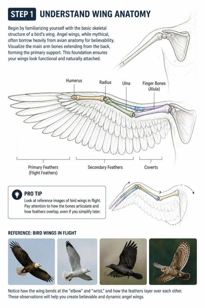
Visualize the main “arm” bones extending from the back, forming the primary support. This foundation ensures your wings look functional and naturally attached.
Pro Tip: Look at reference images of bird wings in flight. Pay attention to how the bones articulate and how feathers overlap, even if you simplify later.
Step 2: Sketch the Basic Shape and Placement
Lightly sketch the central attachment point on your figure’s back. From here, draw two gentle, sweeping curves extending outwards for each wing, defining their overall span and direction.
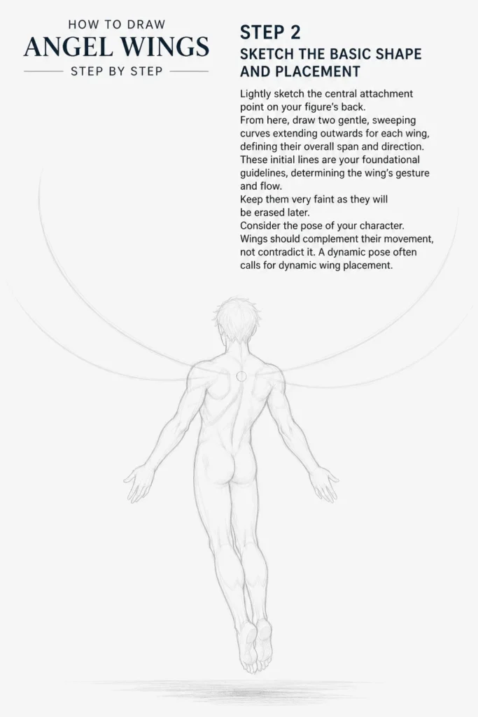
These initial lines are your foundational guidelines, determining the wing’s gesture and flow. Keep them very faint as they will be erased later.
Consider the pose of your character. Wings should complement their movement, not contradict it. A dynamic pose often calls for dynamic wing placement.
Step 3: Map Out Major Feather Groups
Divide each wing into three primary sections: the primary feathers, secondary feathers, and covert (or smaller) feathers. These create the distinct layering of a wing.
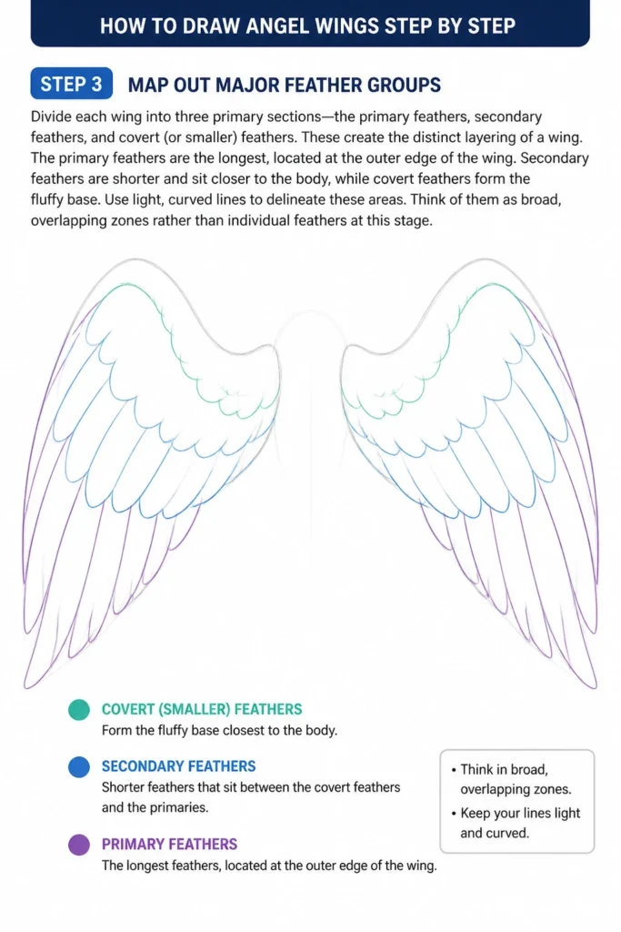
The primary feathers are the longest, located at the outer edge of the wing. Secondary feathers are shorter and sit closer to the body, while covert feathers form the fluffy base.
Use light, curved lines to delineate these areas. Think of them as broad, overlapping zones rather than individual feathers at this stage.
Step 4: Draw the Primary Feathers
Start drawing the individual primary feathers along the outer edge of the wing. These are long, distinct, and slightly curved, fanning out from the wing’s “hand” bone.
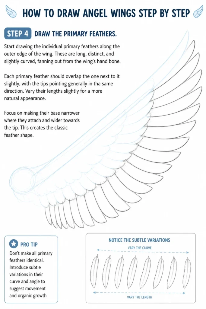
Each primary feather should overlap the one next to it slightly, with the tips pointing generally in the same direction. Vary their lengths slightly for a more natural appearance.
Focus on making their base narrower where they attach and wider towards the tip. This creates the classic feather shape.
Pro Tip: Don’t make all primary feathers identical. Introduce subtle variations in their curve and angle to suggest movement and organic growth.
Step 5: Add the Secondary Feathers
Move inward from the primary feathers and begin sketching the secondary feathers. These are generally shorter and broader than the primaries, forming the main body of the wing closest to the “forearm” bone.
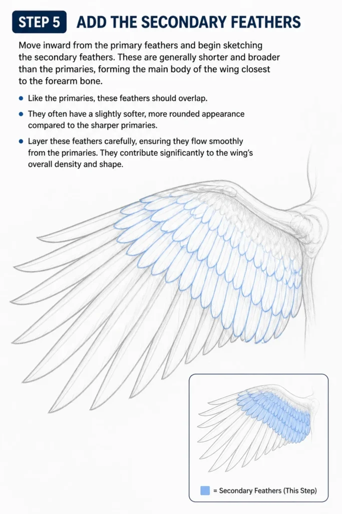
Like the primaries, these feathers should overlap. They often have a slightly softer, more rounded appearance compared to the sharper primaries.
Layer these feathers carefully, ensuring they flow smoothly from the primaries. They contribute significantly to the wing’s overall density and shape.
Step 6: Define the Covert Feathers
Fill in the area closest to the wing’s attachment point with covert feathers. These are much smaller, softer, and often appear fluffier, covering the base of the primary and secondary feathers.
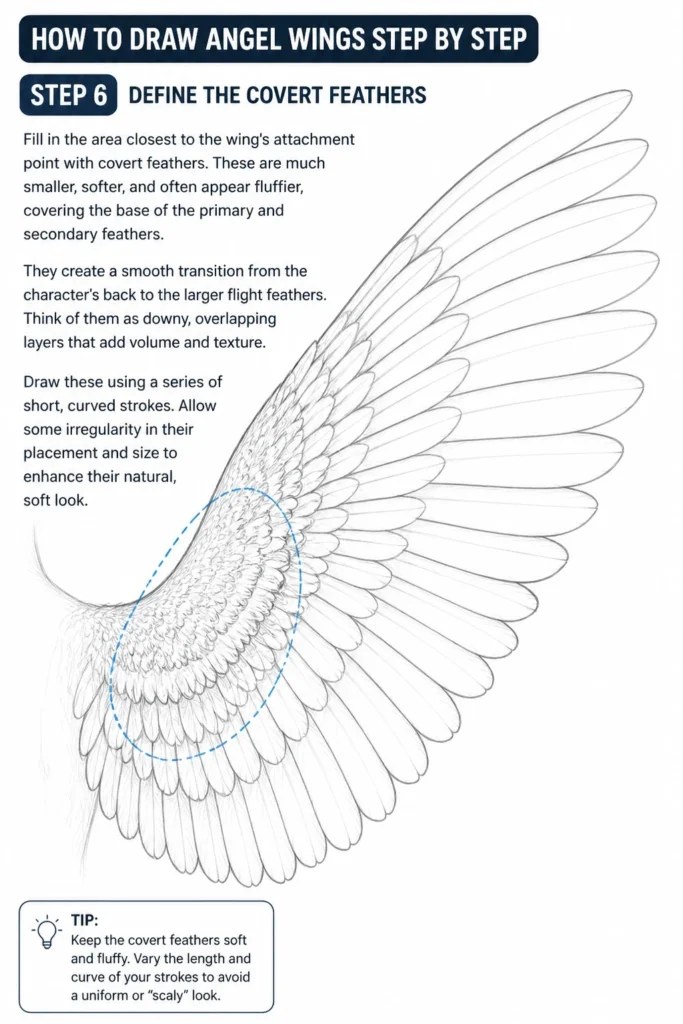
They create a smooth transition from the character’s back to the larger flight feathers. Think of them as downy, overlapping layers that add volume and texture.
Draw these using a series of short, curved strokes. Allow some irregularity in their placement and size to enhance their natural, soft look.
Step 7: Refine Feather Details and Texture
Go back over your feathers and add more specific details. For the primary and secondary feathers, you can lightly sketch in the central quill line (rachis) and subtle barb lines.
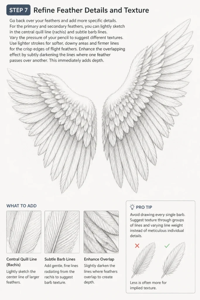
Vary the pressure of your pencil to suggest different textures. Use lighter strokes for softer, downy areas and firmer lines for the crisp edges of flight feathers.
Enhance the overlapping effect by subtly darkening the lines where one feather passes over another. This immediately adds depth.
Pro Tip: Avoid drawing every single barb. Suggest texture through groups of lines and varying line weight instead of meticulous individual details. Less is often more for implied texture.
Step 8: Add Shading and Depth
Determine a light source for your drawing. This will guide where you apply shadows and highlights, giving your wings a three-dimensional quality.
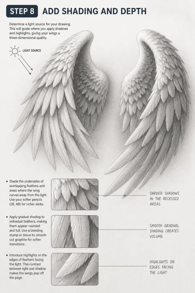
Shade the undersides of overlapping feathers and areas where the wing curves away from the light. Use your softer pencils (2B, 4B) for richer darks.
Apply gradual shading to individual feathers, making them appear rounded and full. Use a blending stump or tissue to smooth out graphite for softer transitions.
Introduce highlights on the edges of feathers facing the light. This contrast between light and shadow makes the wings pop off the page.
Step 9: Clean Up and Finalize
Gently erase any remaining construction lines and stray marks. Use your kneaded eraser to lift graphite from areas you want brighter or to soften edges.
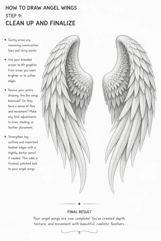
Review your entire drawing. Are the wings balanced? Do they have a sense of flow and movement? Make any final adjustments to lines, shading, or feather placement.
Strengthen key outlines and important feather edges with a slightly darker pencil if needed. This adds a finished, polished look to your angel wings.
Common Mistakes to Avoid
Flat, Lifeless Wings
Many beginners draw wings as if they are perfectly flat against the back. This strips them of their dynamic quality. Remember that wings have volume and curve, especially when attached to a body.
Always consider the three-dimensional form. Sketch in subtle curves and overlaps from the beginning, ensuring feathers appear to wrap around a core structure, not just lay flat.
Ignoring Wing Anatomy
Drawing wings without understanding their underlying structure often results in awkward, unbelievable forms. They might look glued on or lack proper articulation. Even fantasy elements benefit from a basis in reality.
Spend time on the initial skeletal sketch. Knowing where the “bones” are helps you place feathers logically and create a wing that could realistically move and support itself.
Over-Symmetry
While wings are generally symmetrical in design, forcing perfect mirror images can make them look stiff and unnatural. Real wings, especially in motion, have subtle differences.
Allow for slight variations in the curve, length, or angle of individual feathers between the two wings. This small touch of asymmetry adds organic realism and dynamic interest to your drawing.
Feathers Lacking Overlap and Depth
Drawing each feather as a separate, distinct shape without considering how they layer creates a flat, almost pasted-on effect. Real feathers are intricately layered and overlap significantly.
Emphasize the overlapping of feathers, particularly where primary and secondary groups meet. Use shading to enhance these overlaps, creating shadows where one feather passes over another to build depth.
Troubleshooting
Wings Look Stiff or Unnatural
If your wings lack fluidity, you might be drawing too rigidly. The initial sweeping curves are crucial for establishing flow. Revisit Step 2 and focus on creating graceful, expansive lines that suggest movement.
Also, ensure your feather tips aren’t all pointing in exactly the same direction. A slight variation in angle, especially among the primary feathers, can dramatically increase the sense of natural motion.
Feathers Don’t Look Fluffy or Soft
For the soft, downy appearance of covert feathers, avoid harsh, defined lines. Use lighter pencil pressure and short, overlapping, irregular strokes.
Blending can also help. After laying down light pencil marks, gently blend them with a blending stump or a clean fingertip to soften the texture and create a more feathery, plush look.
Difficulty with Perspective and Foreshortening
Drawing wings at different angles or as they recede into the distance can be challenging. If your wings appear distorted, practice basic perspective drawing techniques separately.
Start with simple boxes or cylinders in perspective, then apply those principles to the basic wing shape. Break the wing down into its main sections and foreshorten each section individually before adding feathers.
Key Takeaways
- Start with Structure: Always begin with a basic understanding of wing anatomy and light construction lines.
- Layering is Key: Build your wings by layering feathers from the large primaries to the smaller covert feathers.
- Embrace Flow and Asymmetry: Allow for natural curves and slight variations for a more organic and dynamic look.
- Shading Creates Depth: Use light and shadow to give your feathers volume and make the wings appear three-dimensional.
- Refine Gradually: Don’t try to perfect every detail at once. Work from broad shapes to fine textures.
- Practice Makes Perfect: Consistent practice will improve your ability to draw convincing and beautiful angel wings.
Frequently Asked Questions
What pencil hardness should I use for different parts of the wings?
Start with an HB pencil for initial sketches and guidelines, as it’s easy to erase. Move to a 2B for outlining feathers and adding mid-tones. Use a 4B or softer pencil for deeper shadows and rich darks, which add significant contrast and depth.
How do I make the wings look attached to a character realistically?
The attachment point is crucial. Ensure the base of the wings emerges naturally from the shoulder blade area of the character’s back. Show the muscles around the attachment bulging slightly, indicating the power needed to move the wings. Overlap the character’s body slightly with the wing base.
Can I draw different types of angel wings, like feathered or bat-like?
Absolutely! This guide focuses on feathered angel wings, but the principles of anatomy, structure, and layering apply broadly. For bat-like wings, you’d substitute feathers for membrane and adapt the skeletal structure to resemble a bat’s wing, but the underlying approach remains similar.
How do I add color to my angel wings once drawn?
Once your line art and shading are complete, you can add color using various mediums. Watercolors or colored pencils are great for blending soft hues. Consider a base color, then layer lighter and darker shades to enhance the existing shadows and highlights, maintaining the feather textures you’ve already established.
Our Top Recommended Finds
- Sketching Pencils Set (HB, 2B, 4B, 6B): Provides a versatile range of hardness for all stages of your drawing.
- High-Quality Drawing Paper (Smooth or Medium Tooth): Offers a good surface for blending and fine detail, reducing frustrating smudges.
- Kneaded Eraser: Excellent for lifting graphite gently without damaging the paper, perfect for subtle highlights and cleaning up.
Elevate Your Art: The Journey Continues
You’ve now got the foundational knowledge and practical steps to draw stunning angel wings. This skill opens up a world of creative possibilities for your characters and illustrations.
Don’t stop here. Experiment with different wing poses, explore various feather textures, and integrate these majestic wings into full character designs. Grab your pencils and start creating your own heavenly masterpieces today!
& Painting
No rigid rules or pretension. Just practical guides, medium comparisons, and encouraging tips to help you enjoy the drawing & painting process.