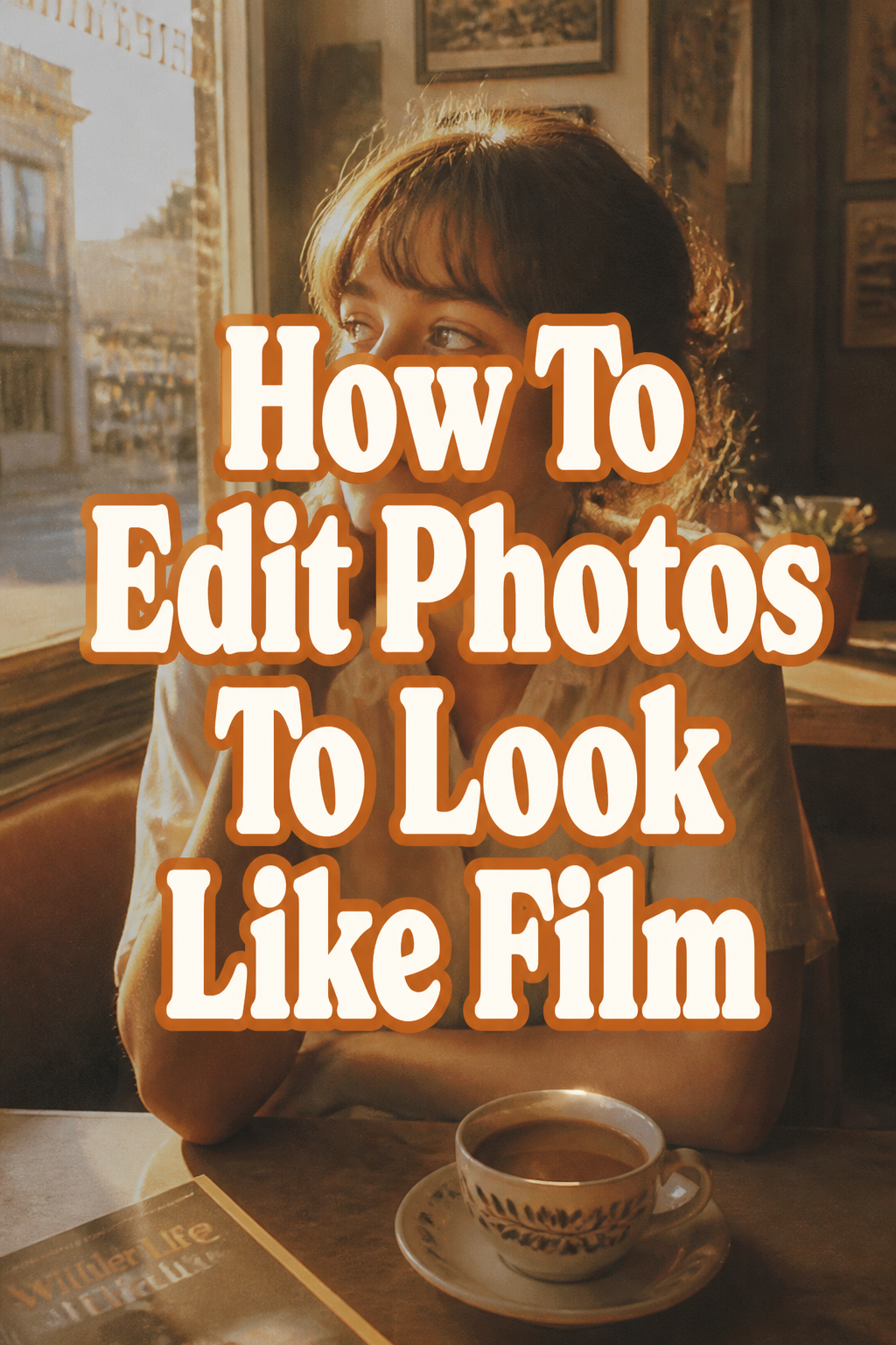
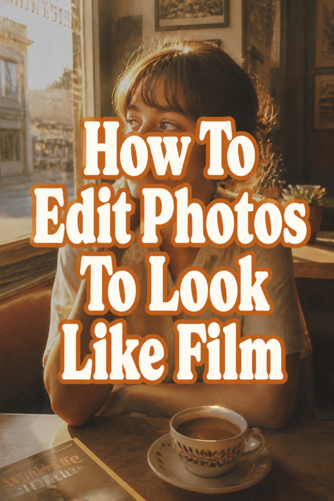
📸 How To Edit Photos To Look Like Film
& Painting
No rigid rules or pretension. Just practical guides, medium comparisons, and encouraging tips to help you enjoy the drawing & painting process.
I spent my early years as a photographer carrying around a beat-up Canon AE-1 and several rolls of Kodak Gold.
Transitioning to digital felt convenient, but I immediately missed the soul and texture that chemical film provides.
After a decade of fine-tuning my editing process, I have found the exact steps needed to bring that vintage warmth to any digital file.
Quick Overview
This guide will show you how to transform clean, clinical digital images into nostalgic masterpieces with depth and character.
- Time needed: 15-20 minutes per photo
- Difficulty: Intermediate
- What you’ll need: A photo editing software (Lightroom, Photoshop, or Capture One), RAW image files, and a keen eye for subtle color shifts.
Step-by-Step Instructions
Step 1: Flatten the Dynamic Range
Digital sensors are designed to capture as much detail as possible in the highlights and shadows.
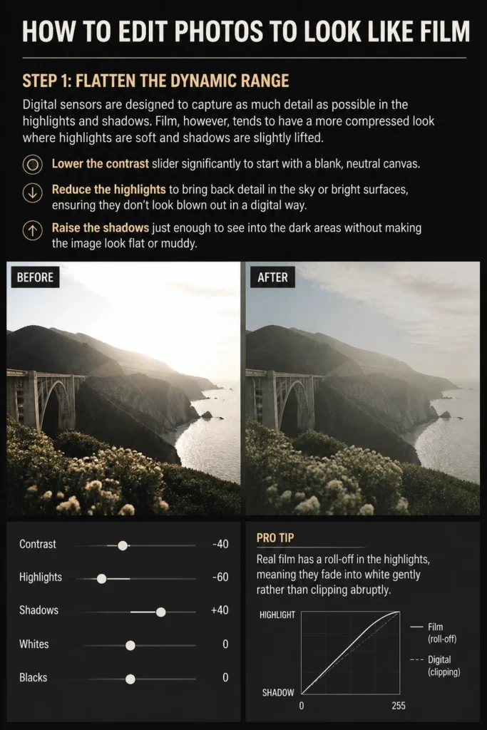
Film, however, tends to have a more compressed look where highlights are soft and shadows are slightly lifted.
Lower the contrast slider significantly to start with a blank, neutral canvas.
Reduce the highlights to bring back detail in the sky or bright surfaces, ensuring they don’t look “blown out” in a digital way.
Raise the shadows just enough to see into the dark areas without making the image look flat or muddy.
Pro Tip: Real film has a “roll-off” in the highlights, meaning they fade into white gently rather than clipping abruptly.
Step 2: Master the Matte Tone Curve
The Tone Curve is the most powerful tool for achieving a film aesthetic because it controls the “fade.”
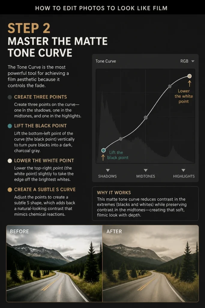
Create three points on the curve: one in the shadows, one in the midtones, and one in the highlights.
Lift the bottom-left point of the curve (the black point) vertically to turn pure blacks into a dark, charcoal gray.
Lower the top-right point (the white point) slightly to take the “edge” off the brightest whites.
Adjust the points to create a subtle “S” shape, which adds back a natural-looking contrast that mimics chemical reactions.
Step 3: Shift the HSL for Organic Colors
Film stocks like Fujifilm or Kodak have specific color signatures that digital sensors do not naturally produce.
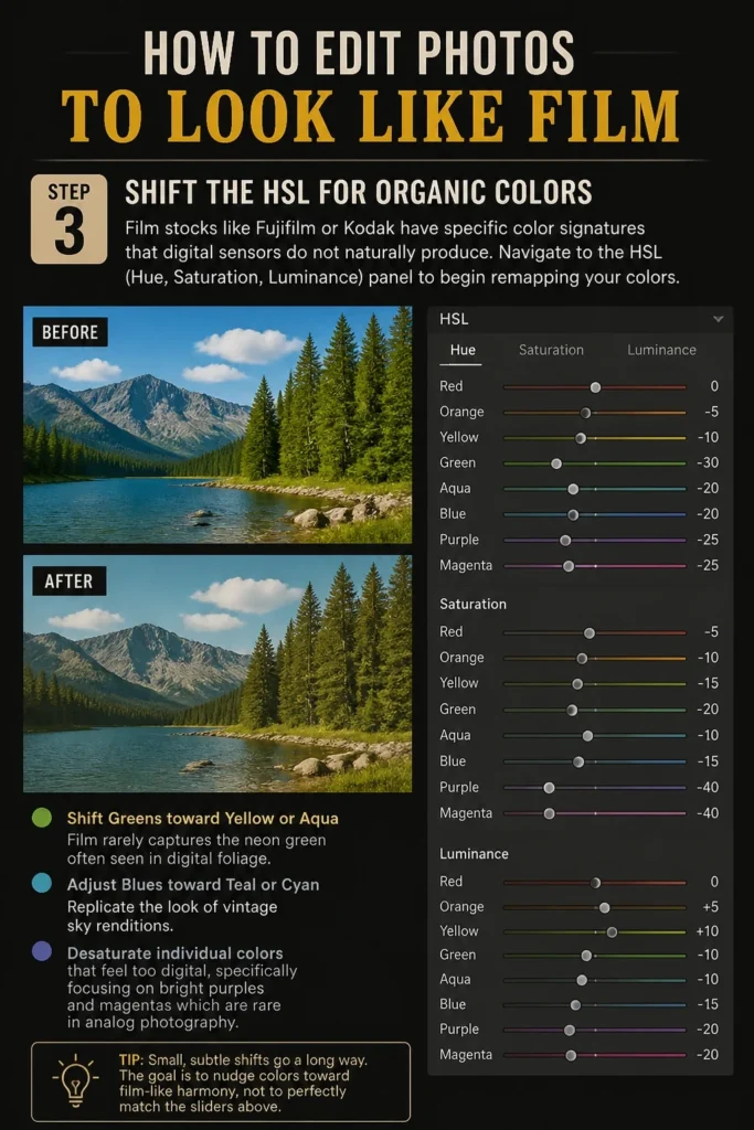
Navigate to the HSL (Hue, Saturation, Luminance) panel to begin remapping your colors.
Shift your Greens toward Yellow or Aqua, as film rarely captures the “neon” green often seen in digital foliage.
Adjust the Blues toward Teal or Cyan to replicate the look of vintage sky renditions.
Desaturate individual colors that feel too “digital,” specifically focusing on bright purples and magentas which are rare in analog photography.
Step 4: Warm Up the White Balance
Most classic film stocks have a distinct warmth, especially those designed for daylight use.

Increase the Temperature slider slightly to introduce a golden hour glow, even if the photo was taken at noon.
Add a touch of Magenta in the Tint slider to counteract the “digital green” cast that many modern sensors produce.
Balance these shifts so that skin tones remain healthy and don’t look overly orange or sickly.
Pro Tip: If you are going for a “cinematic” look, try cooling the temperature slightly but keeping the skin tones warm using a mask.
Step 5: Introduce Analog Grain
Digital noise is usually considered a flaw, but film grain is a cherished texture made of silver halide crystals.
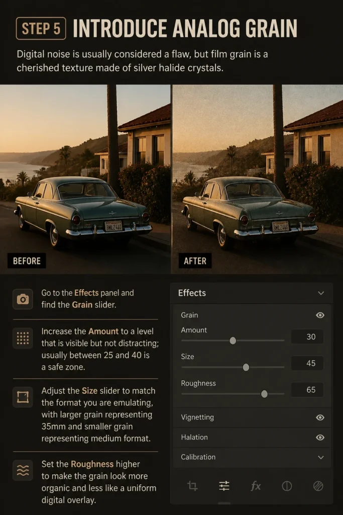
Go to the Effects panel and find the Grain slider.
Increase the Amount to a level that is visible but not distracting; usually between 25 and 40 is a safe zone.
Adjust the Size slider to match the “format” you are emulating, with larger grain representing 35mm and smaller grain representing medium format.
Set the Roughness higher to make the grain look more organic and less like a uniform digital overlay.
Step 6: Apply Split Toning for Mood
Film often has different color casts in the highlights compared to the shadows due to the way chemicals develop.
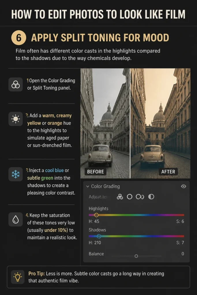
Open the Color Grading or Split Toning panel.
Add a warm, creamy yellow or orange hue to the highlights to simulate aged paper or sun-drenched film.
Inject a cool blue or subtle green into the shadows to create a pleasing color contrast.
Keep the saturation of these tones very low (usually under 10%) to maintain a realistic look.
Step 7: Soften the Image with Negative Clarity
Modern lenses are often too sharp, making photos look clinical and harsh.
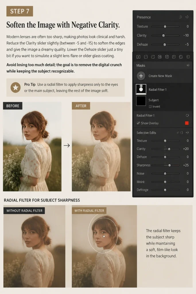
Reduce the Clarity slider slightly (between -5 and -15) to soften the edges and give the image a “dreamy” quality.
Lower the Dehaze slider just a tiny bit if you want to simulate a slight lens flare or older glass coating.
Avoid losing too much detail; the goal is to remove the “digital crunch” while keeping the subject recognizable.
Pro Tip: Use a radial filter to apply sharpness only to the eyes or the main subject, leaving the rest of the image soft.
Step 8: Simulate Halation
Halation is the red glow that appears around bright light sources or high-contrast edges in film like Kodak Portra.
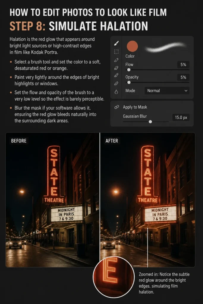
Select a brush tool and set the color to a soft, desaturated red or orange.
Paint very lightly around the edges of bright highlights or windows.
Set the flow and opacity of the brush to a very low level so the effect is barely perceptible.
Blur the mask if your software allows it, ensuring the red glow bleeds naturally into the surrounding dark areas.
Common Mistakes to Avoid
Crushing the Blacks Too Much
While film has faded blacks, many people overdo the “matte” look by lifting the black point too high. This results in a “washed out” image that lacks any punch or depth. You want the blacks to be soft, but the image should still have a clear anchor point in the shadows.
Using Uniform Digital Noise
Adding a standard “noise” filter in Photoshop is not the same as adding film grain. Digital noise is monochromatic and pixel-based, whereas film grain is chunky and reacts to the light in the image. Always use a dedicated grain tool that allows you to adjust size and roughness independently.
Over-Saturating the Entire Image
Digital saturation is very different from the way film handles color density. Simply sliding the “Saturation” bar to the right will make your photo look like a cheap smartphone edit. Instead, use the “Vibrance” slider and individual HSL controls to build color depth slowly and naturally.
Troubleshooting
Skin Tones Look Orange or Unnatural
When you shift the white balance or add warmth, skin tones are the first thing to break. Use a selection mask on the skin and pull the saturation back down. You can also shift the “Orange” hue slider toward the red side to make skin look more flushed and less like a spray tan.
The Grain Looks Like Sand or Dirt
If your grain looks distracting rather than aesthetic, your “Size” or “Roughness” settings are likely too high. Try reducing the size of the grain so it blends into the textures of the photo. Grain should be most visible in the midtones and almost invisible in the deepest shadows and brightest highlights.
The Image Lost All Its “Pop”
If your photo looks flat after lowering contrast and highlights, you need to use the “Whites” and “Blacks” sliders. While the Tone Curve handles the overall fade, these sliders can help you regain a bit of dynamic range. Pull the “Whites” up until the brightest part of the image feels alive again without being harsh.
Key Takeaways
- Use the Tone Curve to lift the black point and create a soft, matte finish.
- Shift greens toward yellow and blues toward teal for a classic film color palette.
- Add organic grain with varied size and roughness to break up digital perfection.
- Soften the image using negative clarity to mimic older, less clinical lenses.
- Apply subtle color grading with warm highlights and cool shadows for a cinematic feel.
- Prioritize RAW files to ensure you have enough data for heavy color manipulation.
Frequently Asked Questions
Can I achieve this look with a smartphone app?
Yes, apps like VSCO and Tezza are built specifically to emulate film stocks. However, they often apply a “one-size-fits-all” filter that might not suit every lighting condition. For the best results, use the manual tools within those apps to adjust the grain and tone curve yourself.
What is the best film stock to emulate for beginners?
Kodak Portra 400 is arguably the most popular film stock to emulate because of its beautiful skin tones and warm highlights. It is very forgiving and works well for portraits and street photography. If you prefer cooler, moodier tones, try emulating Fujifilm 400H.
Do I need to shoot in RAW to get a film look?
While you can edit JPEGs, shooting in RAW is highly recommended. RAW files contain much more information in the shadows and highlights, allowing you to “stretch” the colors and tones without the image falling apart. JPEGs will often show “banding” or pixelation when you try to apply heavy film-style edits.
Why does my film edit look “cheap”?
The most common reason is lack of subtlety. Film emulation is about a thousand tiny changes rather than one big change. If your grain is too big, your fade is too high, or your colors are too shifted, the effect becomes a caricature of film rather than a convincing recreation.
Our Top Recommended Finds
- Lightroom Presets: Look for “Mastin Labs” or “The Archetype Process” for presets that are scientifically calibrated to match real film scans.
- Black Mist Filter: A physical lens filter that softens highlights and creates a natural “bloom” before you even start editing.
- Vintage Lenses: Buying an inexpensive adapter to use old manual lenses on your digital camera will give you the “film look” optically, saving you time in post-production.
Mastering Your Analog Aesthetic
Editing photos to look like film is a journey of unlearning the “perfection” of modern technology.
The more you study real film scans, the more you will notice the beautiful imperfections that make an image feel human.
Start by experimenting with your favorite childhood photos or old magazines to see how colors were handled in the past.
Take one of your favorite digital shots today and try to apply these steps to see how a little grain and a curve shift can change the entire emotional weight of the image.
& Painting
No rigid rules or pretension. Just practical guides, medium comparisons, and encouraging tips to help you enjoy the drawing & painting process.